Lynette Jackson's iPhone Art
The folks at Spillman Farmer Architects tipped me off to the digital art of Lynette Jackson, whose images reside on Flickr. Jackson, of Atlanta, Georgia, attests that the images are "taken, edited, and processed with the iPhone." Knowing this, I'm more amazed by the images -- in many cases equal blends of architectural photography and illustration or painting -- that are appealing even without this process made explicit.
Below is a smattering of the 148 images (to date) found on Ms. Jackson's (aka Page67) Flickr account. Images appear to be created in short series of four, whereby colors, patterns, and sometimes buildings are consistent. Each is a free-form canvas with manipulations that tend towards the orthogonal. All of the images have an evident balance of parts and careful means of leading the eye. With the square format, I could see many of the images gracing album covers, if such things exist anymore.
The images below are presented without comment, but I interpret Jackson's images -- at least the ones with architectural subject matter -- as providing new ways of looking at buildings. The layering of photography, color, and pattern creates an emphasis on certain parts of a building, particularly details of facades. Most of the photos are of a vantage point from below, one we can all relate to, so the new way of seeing isn't literal; it derives from architecture used as a component in a piece of art. If anything, a stronger appreciation for architecture -- especially for modern architecture, which most people supposedly don't like -- should arise from looking at Jackson's iPhone canvases.
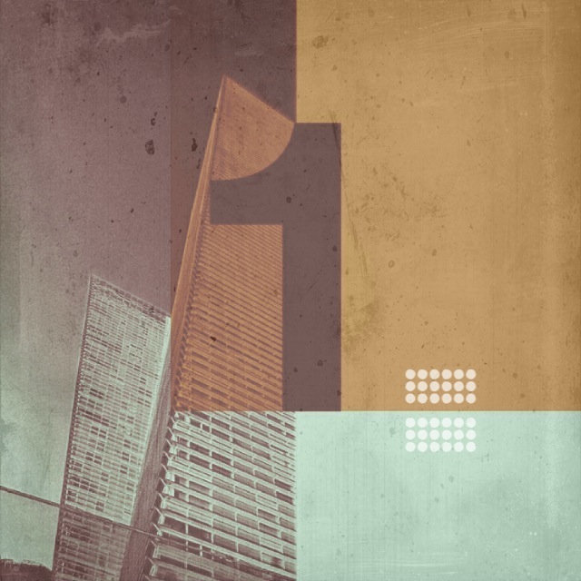
[No._408]
[MSCED_02262012_No._379a Remixed]

[MSCED_02092012_02a Remixed]
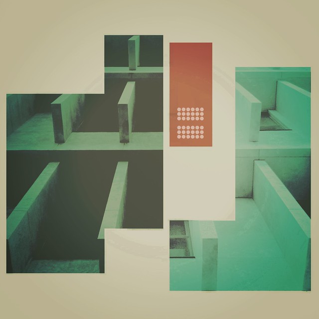
[No._351]

[MSCED_01302012_01]
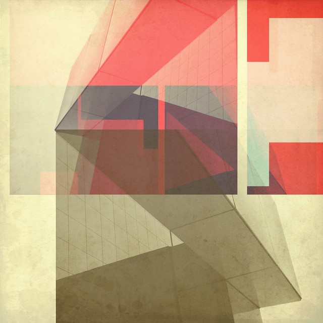
[No._322]
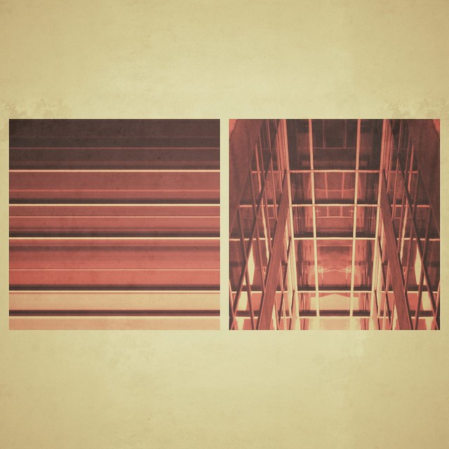
[MSCED_01152012_04]
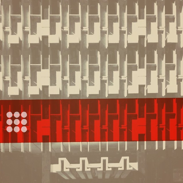
[No. 285 Mixed-Red]
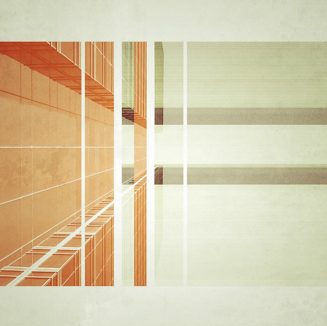
[No._254]

[Mixed_003_01]
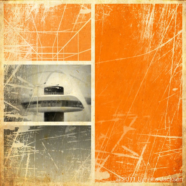
[Remix_The Theme Building at LAX_01.]