28 in 28 #28: Architecture Concepts: Red Is Not a Color

February is Book Month on A Daily Dose of Architecture. The "28 in 28" series features a different book every day of the month.

Architecture Concepts: Red Is Not a Color by Bernard Tschumi
Rizzoli, 2012
Hardcover, 776 pages

28-28_tschumi.jpg

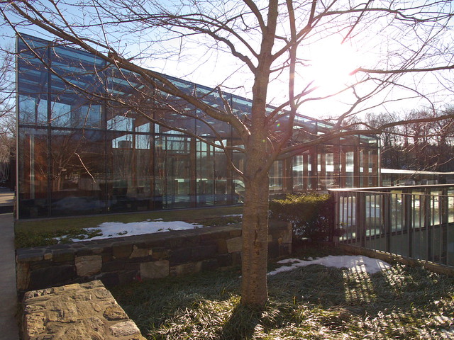
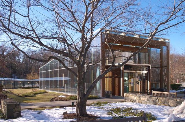
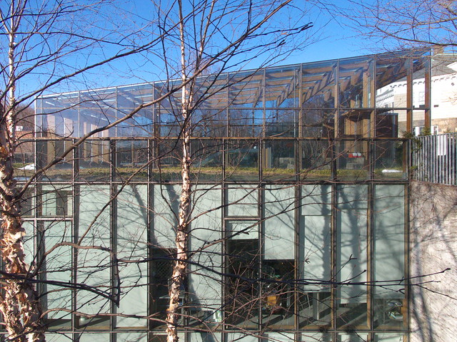
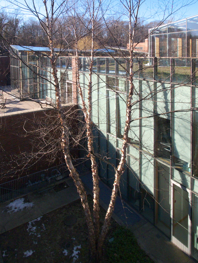
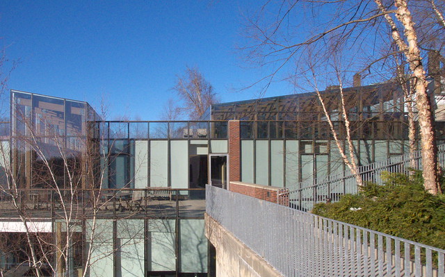
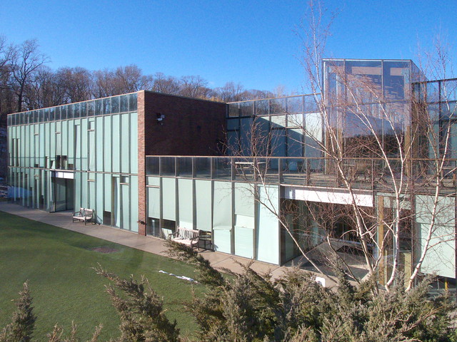
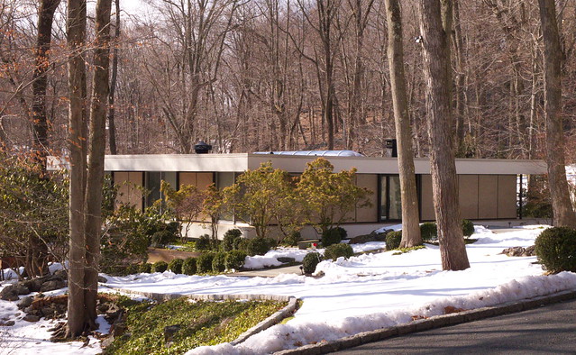
On page 741 of this hefty 7-pound tome spanning five decades of Bernard Tschumi's architecture and writing comes a new essay, "Architecture Concepts." In it the architect writes, "Concepts are what allow us to apprehend reality," and, "Inventing a new concept always starts by determining the right architectural question." Those familiar with Tschumi's theoretical work will not be surprised by his starting point; a 1990 book with some of his writings is even called Questions of Space (Architectural Association). But readers who have journeyed through the first 740 pages of the book will have grasped it as well, given that Tschumi begins each project's presentation with one or more questions—Le Fresnoy, for example: "Can one achieve architecture without resorting to design? What if, instead of designing a new building, you keep one slated for demolition? Hod do you insert an original program inside the old and new structures simultaneously? How do you reconcile coherence with multiplicity?"

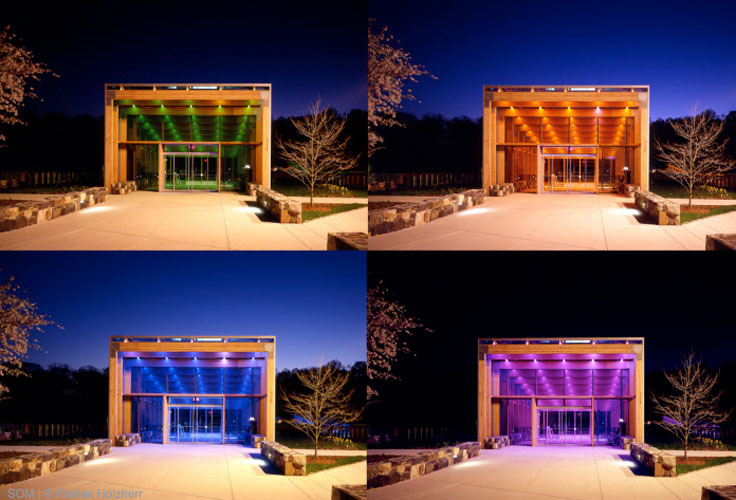
The word "you" stands out in these questions. As I wrote about it in my Notable Books of 2012 list at Designers & Books, "Curiously [Tschumi] writes in the second person, a tactic that is intended, among other things, to 'draw the reader in,' and which ultimately is successful due to the text’s conversational tone and its thoughtful integration with numerous illustrations." This happens throughout the book but most notably in the "photoessays" that preface the five parts: A-Space Event Program; B-Program: Juxtaposition/Superimposition; C-Vectors & Envelopes; D-Concept/Context/Content; E-Concept-Form. The illustrations in these sections fall well outside of Tschumi's architecture, such as a photo of a gymnasium being used for voting in Part B, where Le Fresnoy is located. This photo reveals how the illustrations are part inspiration, part polemic, and they strengthen his arguments; the gymnasium, for example, makes it clear that programmatic juxtapositions are becoming the norm, not the exception.

The book's five parts are thematic but they are also chronological (with a few exceptions), illustrating shifts in concerns over the years, if gradual rather than dramatic ones. And this does not mean, for example, that "space event program" has been set aside in the current emphasis on "concept-form." Rather, the conceptual approaches have expanded as commissions have done the same. But with more and more projects since his breakthrough 1982 competition win for Parc de la Villette, there is a sharp decrease in the essays from Part A and Part B to the rest of the book. This is no surprise, as Tschumi, like other academic-architects, wrote a lot in the 1970s and early 1980s when work was slim. That theorizing laid a groundwork for conceptualizing about projects that would later make the move successfully from idea to reality. This large book encapsulates the evolution of Tschumi's five-decade-long (and counting) career, making his thinking and architecture more accessible and understandable to a larger audience.

US: Buy from Amazon.com CA: Buy from Amazon.ca UK: Buy from Amazon.co.uk

28 in 28 #27: a+t 39-40

February is Book Month on A Daily Dose of Architecture. The "28 in 28" series features a different book every day of the month.

a+t 39-40: Reclaim Remediate Reuse Recycle edited by Aurora Fernandez Per and Javier Mozas
a+t, 2012
Paperback, 312 pages

28-28_at39-40.jpg

One of the most distinctive things about a+t magazine is the way it presents recent architecture in themed series. Most recent was the Strategy series; before it Hybrids, Civilities, and so forth. These topics (focusing on landscapes, large buildings, and public buildings, respectively) respond to trends in the world of architecture while also taking critical positions toward them. Choosing to look at buildings that hybridize housing, offices, recreation, and other uses, for example, is a way to present projects like Steven Holl's Sliced Porosity Block, but the act also takes a position on how the city should evolve—taking into account a mix of uses, demographics, and other features that respond to the growing diversity of urban and suburban areas around the world.

The publisher's newest series is Reclaim, which starts with a double issue subtitled "Remediate, Reuse, Recycle." The editors promote the series in an "environmental sense to reclaim the territory, the objects, the infrastructures and the materials [and] a call to reclaim dignity and citizen rights. It is a wake-up call to morally reclaim society using the Re- processes as atonement." In his introduction, Javier Mozas describes how the three subsets of Reclaim (remediate, reuse, recycle) into which the 82 projects are situated contain all of the other re-processes—rebuild, remake, reinvent, restore, etc. Of course, to reclaim, remediate, reuse, and recycle is to maintain and transform an existing building or landscape, therefore using less energy for demolition and construction of an alternatively new entity. In this sense Reclaim is an extension of Strategy—but one that works on smaller scales (Strategy dealt with landscape urbanism and other means of designing landscapes in cities)—and an increasing focus on sustainability as a path for continuity of the species.

The order of the double issue's chapters—Remediate, Reuse, Recycle—means that the projects move from the large to the small, from the landscape to the building to the material. Therefore the chapters are not about figuring out what project goes where (a common tactic in many collections of contemporary architecture) or about typology (landscapes, for example, can also be found in the Recycle chapter), but about what it means to take part in the "re-" strategies.

Like other a+t titles, the design, layout, and quality of presentation is exceptional, though with the new series a new design is in place. Nevertheless the editors' penchant for organizing and cross-referencing is still present. In particular, each project is tagged with page numbers to two chapters at the end the book; one describes the "agents" involved and how they worked together in either top-down or bottom-up scenarios, and the other shows their before-and-after conditions. These concluding chapters ground the 82 projects in action and time, aiding in the discovery of what lessons can be learned beyond the pretty pictures and drawings.

Today's archidose #653

Here are a few photos of "Four cubes to contemplate our environment" (2011) at Château la Coste in Le Puy-Sainte-Réparade, France, by Tadao Ando.

"Four cubes to contemplate our environment"  (Tadao Ando), château La Coste, Le Puy-Sainte-Réparade

"Four cubes to contemplate our environment"  (Tadao Ando), château La Coste, Le Puy-Sainte-Réparade

"Four cubes to contemplate our environment"  (Tadao Ando), château La Coste, Le Puy-Sainte-Réparade

"Four cubes to contemplate our environment"  (Tadao Ando), château La Coste, Le Puy-Sainte-Réparade

"Four cubes to contemplate our environment"  (Tadao Ando), château La Coste, Le Puy-Sainte-Réparade

"Four cubes to contemplate our environment"  (Tadao Ando), château La Coste, Le Puy-Sainte-Réparade

"Four cubes to contemplate our environment"  (Tadao Ando), château La Coste, Le Puy-Sainte-Réparade

To contribute your Flickr images for consideration, just:
:: Join and add photos to the archidose pool, and/or
:: Tag your photos archidose

28 in 28 #26: Beyond Zuccotti Park

February is Book Month on A Daily Dose of Architecture. The "28 in 28" series features a different book every day of the month.

Beyond Zuccotti Park: Freedom of Assembly and the Occupation of Public Space edited by Ron Shiffman, Rick Bell, Lance Jay Brown, and Lynne Elizabeth, with Anastassia Fisyak, and Anusha Venkataraman
New Village Press, 2012
Paperback, 432 pages

28-28_zuccotti.jpg
You can't evict an idea whose time has come.
The above words were written when New York City police were evicting Liberty Square (aka Zuccotti Park) and the Occupy Wall Street encampment in November 2011. The statement attempts to maintain the momentum that OWS had gained since taking over Zuccotti Park in Lower Manhattan on September 17 of the same year. But it also implies that the idea is more important than the physical occupation of (semi-)public space, and therefore the latter is not as important or not integral to the movement. Given that OWS is nowhere to be found in the news 15 months after the eviction, this would seem to indicate that physical presence in public space is really important after all. But even if OWS lies in wait, did those two short months have a lasting impact on how public spaces are seen and used? And what does the movement point to in the design and evolution of the city, particularly in regard to open and public spaces?

These and many more questions are tackled by the numerous contributors to Beyond Zuccotti Park, a book and initiative that are a collaboration of the Center for Architecture, City College of New York School of Architecture, and Pratt Graduate Center for Planning and the Environment, with New Village Press and Architects/Designers/Planners for Social Responsibility. As the title indicates, the collection of essays is not about OWS; it's about the impact of OWS and the thinking about assembly and public space that it has sparked. Of course there are contributions that focus on those couple months in 2011, such as Alexander Cooper's (the designer of Zuccotti Park) analysis of various Occupation sites relative to public transit and Rick Bell's 20 common points among the Occupy "mini-cities." Most of the essays addressing OWS are put into the first section—Occupy! The next four sections attempt to categorize the remainder—Emplacing Equity and Social Justice, Reimagining Public Space, Public Space Over Time, and Responsive Change (the last is split into Public Sector Agents of Change and Designers and Developers as Agents of Change).

If the book were limited to OWS and Zuccotti Park essays it would be much more honed but also a lot slimmer. As is, the topics are looser but the contributions greater and from a larger pool of voices, some of them quite well known. Their takes on public space and assembly could be read as recipes for making urban open spaces amenable for exercising democratic rights. It's certainly a goal that goes well beyond design; or more accurately, the context that design works within is much more charged and contested than in other realms of building and landscape. Consensus won't be found in the varied collection, but like OWS itself, there is a shared dissatisfaction with things, in this case how the public fits into public space.

US: Buy from Amazon.com CA: Buy from Amazon.ca UK: Buy from Amazon.co.uk

Monday, Monday

A Weekly Dose of Architecture Updates:

This week's dose features the Podčetrtek Traffic Circle in Podčetrtek, Slovenia, by ENOTA:
this week's dose

The featured past dose is City Museum Extension in Ljubljana, Slovenia by Ofis Arhitekti:
this       week's  dose

This week's book review is Wiel Arets: Autobiographical References edited by Robert McCarter (L):
this week's book review this week's book review
(R): The featured past book review is Stills: Wiel Arets, A Timeline of Ideas, Articles and Interviews 1982-2010 edited by Roemer van Toorn.

: : : : : : : : : : : : : : : : : : : : : : :

American-Architects Building of the Week:

University of Delaware - Campus Bookstore & University Development Office Building in Newark, Delaware, by DIGSAU:
this week's Building of the Week

28 in 28 #25: Wiel Arets: Autobiographical References

February is Book Month on A Daily Dose of Architecture. The "28 in 28" series features a different book every day of the month.

Wiel Arets: Autobiographical References edited by Robert McCarter
Birkhäuser, 2012
Paperback, 566 pages

28-28_arets.jpg

See A Weekly Dose of Architecture for my review of Wiel Arets: Autobiographical References.

28 in 28 #23+24: Two NYC Books

February is Book Month on A Daily Dose of Architecture. The "28 in 28" series features a different book every day of the month.

New York Neon by Thomas E. Rinaldi
W. W. Norton, 2012
Paperback, 192 pages

New York Nights by James T. and Karla L. Murray
Gingko Press, 2012
Hardcover, 276 pages

28-28_NYC.jpg

November saw the release of two books documenting New York City in the hours between sunset and sunrise, when the glow of artificial lighting adds color to the city's sidewalks. While each book sets its sight on old establishments (you won't find Times Square in these titles), and the names New York Neon and New York Nights even confuse matters, the differences between the two are nevertheless great, as will be seen. Nevertheless, beyond the obvious overlap in subject matter and format (photography books), the books share an appreciation of New York City's ever-changing streetscapes as evidenced in early attempts at getting attention in the 24-hour metropolis. In this sense the books are as much history as photography.

There is actually a smidgen of truth to the old statement about judging a book by its cover. That's not wise if faced with an either/or decision of which one of these books to buy, but an important difference can be gleaned from a quick glance at these covers: With its black background and floating words, New York Neon is about the signs, while the frontal shot on New York Nights signals it's about the shops and restaurants. Rinaldi describes how he initially photographed the signs a couple f-stops lower than what his light meter told him, but over time he varied the technique to show more urban and architectural context; still, detailed shots of signs on dark backgrounds are the majority. On the other hand, the photos in New York Nights are mainly straightforward views of a storefronts, like a nighttime version of the Murray's widely celebrated Store Front. Their book is about the sensations and experience of the establishments on the sidewalk, as they invite us inside through their lighting and interior glow.

Another major difference between the two is size. New York Neon is a fairly compact book that is easy to hold, all the better to hone in on the details of the signage. Photos are one or two to a page, with the occasional two-page, full-bleed spread. Captions sit in the white space on the page but the overall effect is of dark pages with splashes of color. Each sign is distinct but repetition can be found in orientation (vertical and horizontal signs predominate), color (lots of red and orange), and type of establishment (one page even features six liquor stores with very similar signs). On the other end of the spectrum is New York Nights, which spans over two feet when opened on a table. Most of the photographs are one to a page, documentary-like, with text on the opposite page. Each photo is therefore a decent size, enough to grasp the details captured in the duo's long-exposures.

One more difference is how the books tell their stories beyond the photographs. With his sights squarely on neon, Rinaldi delves into a lengthy history of illumination in the city, spending a good chunk on the fascinating "anatomy of the industry." Many of the photos even credit the sign makers, a testament to the skill required to produce neon signs. The Murrays focus on the establishments through interviews with proprietors. They are not as interested in the details of lighting that give each storefront its presence at night, outside of what comes across in the photographs.

Even with the above differences, each book is accurate in its depiction of the city at night. Neon is a collection of quick glances where the glow of the neon is burned into our memory. Nights feels like sideways glances as one walks home from a bar. Neither book has many people, so the reader can be alone with the images and make them as much a part of his or her memory as they are for the photographers who snapped them.

New York Neon:
US: Buy from Amazon.com CA: Buy from Amazon.ca UK: Buy from Amazon.co.uk

New York Nights:
US: Buy from Amazon.com CA: Buy from Amazon.ca UK: Buy from Amazon.co.uk

Today's archidose #652

Here are a few photos I took of the Greenwich Academy - Upper School in Greenwich, Connecticut, designed by SOM (2002). The glass entrance structure features a light installation by James Turrell.

Greenwich Academy

Greenwich Academy

Greenwich Academy

Greenwich Academy

Greenwich Academy

Greenwich Academy

Greenwich Academy

To contribute your Flickr images for consideration, just:
:: Join and add photos to the archidose pool, and/or
:: Tag your photos archidose

28 in 28 #22: Post-Ductility

February is Book Month on A Daily Dose of Architecture. The "28 in 28" series features a different book every day of the month.

Post-Ductility: Metals in Architecture and Engineering edited by Michael Bell, Craig Buckley
Princeton Architectural Press, 2012
Hardcover, 272 pages

28-28_ductility.jpg

One of Columbia University GSAPP's "flagship projects" is the Materials Project, which consists of conferences and subsequent publications on concrete, glass, metals, and plastics, with light supposedly forthcoming. When I reviewed Engineering Transparency, the book on the glass conference, I noted that "the symposium and book are equal parts architecture and engineering, theory and practice, eye candy and data." The same can be said for Post-Ductility, keeping with conference chair Michael Bell's organization of the conferences into a symbiotic mix of the theoretical and the technical. (This extends to the plastics conference, Permanent Change, as my notes from both days attest.)

The book is structured in five sections: History and Theory, Projects (five of them), Structural Engineering, Energy and Sustainability, and Experimental Fabrications. While one of the projects, Rafael Moneo's Northwest Corner Building at Columbia (gracing the cover), embodies metal's use both as structure and decoration, the book also delves into the hidden realm of metals—reinforcing, wiring, even ducts. These other areas are in the minority in the book, but they illustrate the post in post-ductility; "the elastic capacities of materials are inextricably lost as determining values," as Bell puts it in his introduction. In other words, a host of other considerations are explored besides, for example, how steel is shaped into complex structures: the production and reuse of metals, the developments of materials scientists, and the implications of metals' pervasiveness.

Even with this broad approach to metals, the chapter on structural engineering is a highlight, as are projects like the Northwest Corner Building that are complex structures requiring the use of steel. OMA's CCTV, the new San Francisco-Oakland Bay Bridge, and a bunch of other bridges are part of what make up the structural engineering chapter; these give a strong indication of the link between structure and formal creativity. The energy and sustainability chapter is also a highlight. Perhaps this is because the technical/engineering aspect of these chapters is a nice foil to the history and theory elsewhere in the book. A solid and concerted balance between the technical and the theoretical grounds the various ideas in practice, where thinking about materials really comes into fruition.

US: Buy from Amazon.com CA: Buy from Amazon.ca UK: Buy from Amazon.co.uk

Today's archidose #651

Here are a few photos I took of the Tallwoods Road House in Armonk, New York, designed by Arthur Witthoefft in 1957 and restored by Todd Goddard and Andrew Mandolene in 2007.

More information can be found at Dwell and DOCOMOMO US/NY Tri-State.

Update: The above struck-out text refers to a nearby house also designed by Arthur Witthoefft, not this one. Thanks to Julie for the correction.

Tallwoods Road House

Tallwoods Road House

Tallwoods Road House

To contribute your Flickr images for consideration, just:
:: Join and add photos to the archidose pool, and/or
:: Tag your photos archidose

28 in 28 #21: BIM in Small-Scale Sustainable Design

February is Book Month on A Daily Dose of Architecture. The "28 in 28" series features a different book every day of the month.

BIM in Small-Scale Sustainable Design by François Lévy
Wiley, 2011
Hardcover, 312 pages

28-28_BIM.jpg

At its core BIM (Building Information Modeling) is a pretty simple idea: A 3-dimensional virtual model is embodied with data that can be used to generate drawings, spreadsheets, and other relevant output. But the complexities are many, partially due to the fact that the shift from CAD to BIM is a much greater one than the shift from hand drafting to CAD. The earlier transition from paper to digital still involved the drawing of plans, sections, elevations, and so forth via lines, but BIM dispenses with drawing (for the most part, at least) in favor of the modeling of systems (walls, windows, doors, roofs, etc.). On top of that fact is learning BIM software, determining how to integrate BIM into an office's and project's workflow, and coordinating with consultants, among many other considerations.

When it comes to integrating BIM within a project's workflow, it is often used purely for construction documents, coming after schematic design and entering the picture sometime within design development, depending on the firm. François Lévy, an architect in Austin, Texas, believes that for small, skin-load dominated buildings (versus large, systems-heavy buildings) BIM is best introduced in the early phases of a project, where it can be used to aid with site analysis, massing, solar studies, passive heating/cooling, and hydrology, to name a few areas where the intelligent modeling can be queried for information. This is not to say that a highly detailed and "figured out" model needs to be generated in the conceptual or schematic design phase; BIM software enables models with respectively "lo-fi" information to be created and still carry intelligent data.

Lévy's argument unfolds over eleven chapters that address the uses of BIM mentioned above, as well the relationship between BIM and sustainable design, BIM software, and collaboration. Each chapter is accompanied by a brief case study that is helpful in grounding Lévy's ideas in specific practices, most of them external to his own. Falling somewhere between a technical textbook and a theoretical exposition, the book is helpful as a guide for architects interested in integrating BIM into their workflow. With an emphasis on small buildings (single-family houses, mainly), that pool is large, and the book makes a convincing argument for working BIM into the early stages of a design. That argument would be even stronger if the book were illustrated in color; as is, many of the renderings and model views lack contrast and differentiation between surfaces to make them fully legible. This is unfortunate but not a fatal flaw for a book that intelligently embraces a technology's impact on making buildings better and more responsible.

US: Buy from Amazon.com CA: Buy from Amazon.ca UK: Buy from Amazon.co.uk

28 in 28 #20: Intensities

February is Book Month on A Daily Dose of Architecture. The "28 in 28" series features a different book every day of the month.

Lewis.Tsurumaki.Lewis: Intensities by Paul Lewis, Mark Tsurumaki, David J. Lewis
Princeton Architectural Press, 2013
Paperback, 192 pages

28-28_LTL.jpg

LTL Architects is very particular about the names of their monographs. Their first—the 21st in the Pamphlet Architecture series—is called Situation Normal...; it is the beginning of the acronym SNAFU (the rest is All F@*!ed Up), which describes a "normal" state where things are a little bit off (their project for a putting green/smoker's lounge on the window-washing armature of the Seagram Building is a good case in point). Ten years later they followed up with Opportunistic Architecture, what they describe as "a design philosophy that transforms the typically restrictive conditions of architectural practice—small budgets, awkward spaces, strict zoning—into generators of architectural innovation." Just over four years later comes Intensities, what they describe in the introduction as "a focused form of architectural practice ... [they] engage the pragmatics of a given project, pursuing design invention through nonlinear yet logical sequence of speculations and probes." Further, "the work that materializes is then saturated, multilayered, or otherwise demonstrative of an intensification of architecture itself."

The compressed time frame of the newest monograph—half the time between the first two—indicates that LTL is producing and building more at a faster pace (will the next one be in two years?). Twenty projects are in the book, about half of them built. On the cover is the Arthouse at the Jones Center, a renovation of a (very) old building in Austin, Texas, for a contemporary arts space; the project also ends the book, perhaps as a way to bookend the contents. The cover's photo/drawing hybrid grounds the project in their early projects that are heavy on perspective drawings, something they have not abandoned, even as they have refined the method to incorporate computers. The project also documents LTL's design and fabrication of mobile lounge furniture, harking back to the small Lower East Side eateries that they used to install themselves. So as projects have expanded in scale and frequency, and moved beyond their Manhattan locale, many things have remained constant.

In addition to the Arthouse, the projects given the most pages are Water Proving Ground (their contribution to MoMA's 2010 Rising Currents show), the Sullivan Family Student Center at the University of Wyoming (the project is anchored by a double-height topographic mural of the state, echoed in their office design for The Open Planning Project, which features shelving in the shape of Manhattan), and the Claremont University Consortium Administrative Campus Center (another renovation, one that illustrates how their skill with small interiors has been successfully carried to larger projects). Yet even projects given only a couple pages are presented with the same attention to detail as these and others. Each project reveals a consistent approach that emphasizes quality of space and detail. The equally consistent presentation that mixes photos, drawings, and words makes the book extremely rich, indicative of their talents.

US: Buy from Amazon.com CA: Buy from Amazon.ca UK: Buy from Amazon.co.uk