Tokyo Skytree Tower

On May 22 the Tokyo Skytree Tower opened, providing access to its observation decks. It is the second-tallest structure in the world, behind the Burj Khalifa in Dubai. But what I want to know is...

skytree.jpg
[Tokyo Skytree Tower Elevation | image stitched by archidose from this source]

Who designed it?

Nikken Sekkei is credited as architect at WAN and Wikipedia. But I recall early reports that Tadao Ando was responsible for the design. Of course, both could be correct, and Nikken Sekkei could be the executive architect, having executed Ando's design. But the news swirling around the opening of the "world's tallest free-standing broadcasting tower" omits any mention of Ando. Personally I have a hard time seeing Ando anywhere in the design, even if the steel lattice-like structure of the bottom half is pretty elegant; the top half is pretty clunky, the result of broadcasting functionalism over design, and observation decks designed like control towers rather than integral parts of the tower. I can't help but think that the recent cutbacks for the 1WTC spire will result in an equally inelegant top.

(For more tall building porn, see this earlier post.)

Tuesday, Tuesday

A Weekly Dose of Architecture Updates:

This week's dose features Brooklyn Botanic Garden Visitor Center in Brooklyn, New York by WEISS/MANFREDI:
this       week's  dose

The featured past dose is the The Diana Center at Barnard College in New York City by WEISS/MANFREDI:
this       week's  dose

This week's book review is Italo Calvino's Architecture of Lightness: The Utopian Imagination in an Age of Crisis by Letizia Modena (L):
this week's book review   this week's book review
(R): The featured past book review is Deconstructing the Kimbell by Michael Benedikt.

World-Architects.com U.S. Building of the Week:

Roosevelt University Academic, Student Life and Residence Center in Chicago, Illinois by VOA Associates:
this week's Building of the Week

Unrelated links are now found in the left sidebar and on My Diigo Bookmarks page.

Theaster Gates and the Prairie Avenue Bookshop Archive

Back in the summer of 2009, when it was reported that Chicago's Prairie Avenue Bookshop would close its doors, I held on to the notion that somebody might save the architecture bookstore, or at least the books. While I anticipated a savior would keep the consumer format, what eventually happened is more remarkable. Chicago-based artist Theaster Gates acquired 14,000 volumes from Prairie Avenue's owners in the fall of 2009, a couple months after the store closed, subsequently moving the books into a renovated residence on South Dorchester Avenue (top photo) as part of a public archive.

dorchester1.jpg
[All images are stills from "What does it mean for us to be generous with one another?" with Theaster Gates | image source]

The Dorchester Project, as Gates calls it, encompasses more than the Prairie Avenue Bookshop Archive (below photos); it also contains 60,000 glass lantern slides from the University of Chicago's art history department and 10,000 LPs from Dr. Wax, a record store that had existed in nearby Hyde Park (a Chicago neighborhood also home to U. of C.). Of course, what all three of these archives have in common is a recent transformation and obsolescence of the media (books, slides, records) brought on by the digitization of words, images, and music. Gates, in the act of creating an archive on the south side of Chicago, is "giving these objects another life" and "reflecting upon things that have been forgotten or that we have come to believe have no value." [source with Gates' quotes]

dorchester2.jpg

But these archives are just the tip of Gates' ambitions to also transform forgotten neighborhoods, be it on Chicago's South Side or elsewhere. He has purchased two more buildings next to and across from his Dorchester Project, adding a food pavilion, an artist-in-residence space, and facilities for artists. He founded the Rebuild Foundation, "a not-for-profit, creative engine focusing on cultural and economic redevelopment and affordable space initiatives in under-resourced communities." In addition to Chicago, they have projects in Detroit, Omaha, and St. Louis. And lastly he is collaborating with Brinshore Development and Landon Bone Baker Architects to renovate an abandoned 36-unit CHA property near his Dorchester Projects into mixed-income housing and a cultural center; groundbreaking is set for this year.

dorchester3.jpg

While certainly an artist -- with numerous exhibitions in various U.S. museums -- it's no surprise that Gates has a degree in urban planning (alongside ceramics and religious studies, no less). He seems to be finding a groove that balances these various interests (at least art and planning), so they reciprocally inform and benefit each other. A certain breaking down of boundaries is taking place, one of the many things I find commendable in his (art)work. And obviously he has great taste in books.

Today's archidose #588

Here are a couple photos of the Parque del Cabo in Gijón, Spain by Ángel Noriega Vázquez, 1997. Photographs are by Paul Prudence.

Parque del Cabo San Lorenzo

Parque del Cabo San Lorenzo

To contribute your Flickr images for consideration, just:
:: Join and add photos to the archidose pool, and/or
:: Tag your photos archidose

Book Briefs #9: Architecture Briefs

"Book Briefs" are an ongoing series of posts with two- or three-sentence first-hand descriptions of some of the numerous books that make their way into my library. These briefs are not full-blown reviews, but they are a way to share more books worthy of attention than can find their way into reviews on my daily or weekly pages.

This ninth edition of Book Briefs looks at Princeton Architectural Press's "Architecture Briefs," a successful series "designed to address a variety of single topics of interest to architecture students and professionals." Previously I've reviewed or featured Building Envelopes by Jenny Lovell, Writing About Architecture by Alexandra Lange, Model Making by Megan Werner, and Ethics for Architects by Thomas Fisher; a review of the latest, Urban Composition: Designing Community through Urban Design by Mark C. Childs, is forthcoming. The four series' titles below have been released in roughly the last twelve months, testifying to the popularity of the books and the range of topics to be presented. Remaining titles of the thirteen to date are focused on drawing, architectural photography, digital fabrication, and philosophy. Depending on their topics, most titles share a structure of theoretical backgrounds followed by case studies, with appendices, such as glossaries, helping them serve the intended audience.

BB09-1.jpg

1: Architectural Lighting: Designing with Light and Space by Herve Descottes with Cecilia E. Ramos | Princeton Architectural Press | 2011 | Amazon
One of the strengths of the Architecture Briefs series is having the right author for the right topic. This title on lighting is a case in point, given that Herve Descottes's firm, 
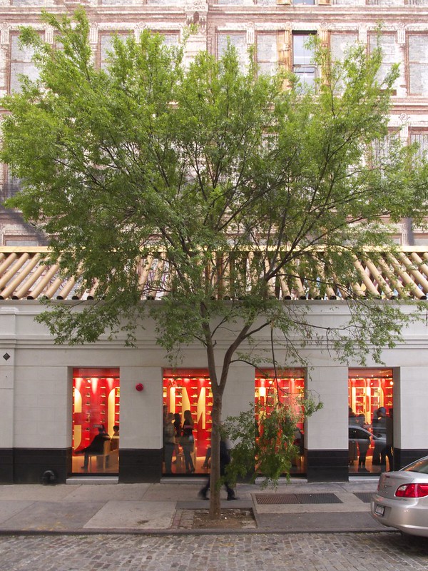
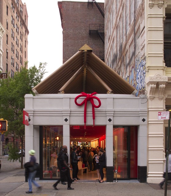
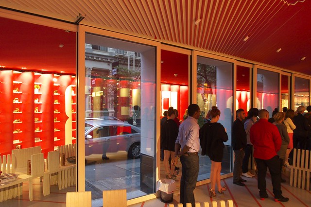
L'Observatoire International, has one of the strongest portfolios of lighting designers today. The case studies of L'Observatoire projects (The High Line, Kiasma Museum of Art in Finland, the Guthrie Theater) are a highlight of the book, following chapters on visual principles of light (illuminance, luminance, color and temperature, height, density, direction and distribution). The case studies elucidate how these principles are taken into account in design. Charts illustrating how various artificial lights work relative to the principles are particularly handy, additionally reiterating that lighting design is engineering, a means of quantifying what is ultimately a qualitative experience.

2: Material Strategies: Innovative Applications in Architecture by Blaine Brownell | Princeton Architectural Press | 2012 | Amazon
This is Blaine Brownell's fifth book with PAPress, following three Transmaterial titles and the excellent Matter in the Floating World. With his Transmaterial website and series of books, Brownell has become a valuable resource in the architectural community for innovative materials and applications. Material Strategies focuses on the latter, how various materials are applied to create striking buildings. It's no surprise that "disruptive technologies and applications" are an important part of the book. The categorization of materials (mineral, concrete, wood, metal, glass, plastic) echoes other books dealing with the same subject matter, but Brownell only skims the technical aspects to focus on the way certain materials are used formally. Unfortunately many of the images in each chapter overview are too small for understanding, but this is overcome in the case studies.

BB09-2.jpg

3: Old Buildings, New Designs: Architectural Transformations by Charles Bloszies  | Princeton Architectural Press | 2011 | Amazon
Charles Bloszies is an architect/engineering working in San Francisco, a city where dealing with historical buildings is paramount. His experience comes through in the discussions of transformations in technical terms, in dealing with controversies arising from reuse, and obviously in the aesthetic possibilities of juxtaposing old and new. But it is also found in his projects inserted amongst higher profile projects by bigger names. Overall the selection of case studies is a varied yet quality mix of small interventions, major additions, repurposed buildings, and none of the abovethe author's wording for the four chapters. I'm a huge fan of new and old existing side-by-side, or in some cases inside-outside, so I'm glad to see a book promoting the practice with various theoretical and formal reasons.

4: Sustainable Design: A Critical Guide by David Bergman  | Princeton Architectural Press | 2011 | Amazon
Sustainable design is a topic that alternatively needs to be written about more to better articulate a meaning and position, and is written about so much that the same thing is said over and over again. David Bergman's book lies somewhere in the middle, but closer to the former, thanks to a predilection for the second of his two categories: incremental solutions and innovative ones. Incremental solutions are things like compact fluorescent light bulbs, which are helpful but not enough. Innovative solutions, on the other hand, ask different questions, such that "how do we make a cleaner, more energy-efficient lawn mower?" is replaced with "is there a better way to design the landscapes surrounding our buildings?" Chapters move from the big picture to details: site issues, water efficiency, energy efficiency (passive and active), indoor environmental quality, materials, labels and ratings.

Camper van Shigeru

Camper Soho
[Looking southwest across Prince and Greene Streets | All photos by John Hill]

On Tuesday evening, Camper unveiled its new Shigeru Ban-designed store on the corner of Prince and Greene Streets in Soho. The store maintains the existing stone exterior walls, enlarges the openings between columns, presents a new interior, and caps it all with a pitched roof made from the Japanese architect's signature cardboard tubes. It's alternately whimsical and serious, designed to surprise people in a number of ways.

Camper Soho
[Looking west]

A glance at Google Street View reveals the existing condition: a one-story PoMo building located on the southwest corner of the intersection (catercorner to the Apple Store Soho) next to a party wall mural that echoes the area's cast iron architecture. The new roof gives the building a stronger presence than before, partly from the jarring contrast between the cardboard tubes and the surroundings. Note the inside of the store between the stone columns (above photo); the red wall with white letters is specially designed to be seen from the corner, as will be revealed below.

Camper Soho
[Looking northwest]

Yet when approaching the building from the south (photo above), the view into the store is different. Instead of a red wall, passersby see shelving.

Camper Soho
[The east elevation]

Seen straight across Greene Street (photo above), these two conditions -- white-on-red graphic and shoe storage -- start to blur together.

Camper Soho
[The north elevation]

The below photo shows close-ups of the store's west wall. Ban has angled the shelves for the shoes so they are invisible from the intersection; one only sees the red wall emblazoned with CAMPER. Everything else in the otherwise open-plan store follows this diagonal and the red/white color scheme, such as the stripes on the floor and the serrated ceiling. The above photo reveals (esp. when seen large) the mirror covering the store's south wall; this surface reflects the shoes so both conditions can be seen simultaneously, as well the scale of the space is that much greater.

Camper Soho
[A montage of the west wall: (L) looking north and (R) looking south]

The interior is a simple yet effective device that merges graphic branding with functional storage. In a sense it is very Japanese: it is both/and, as opposed to either/or; it is a symbiotic balance of two concerns. The space's east wall (photo below) also strengthens the space, making the stone exterior disappear and opening up the store to the exterior via sliding glass walls. Unfortunately the cardboard-tube roof is not visible from inside. A few skylights are cut into the otherwise solid ceiling plane, but their red aluminum fins below glass don't give a clear view of the roof. This feels like a missed opportunity, but one that most likely responds to fire codes and other practical concerns. No wonder the roof is called a "temporary art installation" in a press release for the store. Whatever the case, the store suffers from a split personality. Yet their mutual existence makes each stronger and results in something fresh in Soho's historical Cast Iron District.

Camper Soho
[The inside of the east-facing elevation]

Today's archidose #587

Here are some photos of the Eye Film Institute Netherlands in Amsterdam, The Netherlands by Delugan Meissl Associated Architects, 2012. Photographs are by Klaas Vermaas.

amsterdam eye film institute 19 2012 delugan meissl (overhoekspln)

amsterdam eye film institute 06 2012 delugan meissl (overhoekspln)

amsterdam eye film institute 09 2012 delugan meissl (overhoekspln)

amsterdam eye film institute 21 2012 delugan meissl (overhoekspln)

To contribute your Flickr images for consideration, just:
:: Join and add photos to the archidose pool, and/or
:: Tag your photos archidose

Architect Docs: Kondylis Vs. Portman

Recently I watched documentaries on a couple architects -- Costas Kondylis and John Portman -- who I'd least expect to receive the treatment. Which begged the question, "Why?" Perhaps the answer lies in "How?" So in lieu of straightforward reviews of each film, below is a side-by-side comparison (actually a top-bottom one, given Blogger's limited formatting capabilities) of Building Stories and John Portman: A Life of Building.

2docs.jpg

Running Time:
Kondylis: 58 minutes
Portman: 52 minutes

Director:
Kondylis: Toni Comas
Portman: Ben Loeterman

Writer:
Kondylis: Stuart Elliott
Portman: Ben Loeterman

Interview footage with architect:
Kondylis: No, but actor portrayal in one scene; some audio and footage of architect looking at his buildings
Portman: Yes, footage of interviews as well as candid meetings, lectures, etc.

Predominant type of building photography:
Kondylis: Looking up, tilting; some time-lapse
Portman: Lots of time-lapse

Sampling of people interviewed in the film:
Kondylis: Rick Bell, Kenneth Frampton, James Gardner, Karrie Jacobs, Richard Meier, Francis Morrone, Larry Silverstein, Donald Trump
Portman: Paul Goldberger, K. Michael Hays, Mack Scogin, Jacque Robertson, Portman's children

Score:
Kondylis: Dramatic
Portman: Koyaanisqatsi-esque

Support provided by:
Kondylis: The Real Deal
Portman: Central Atlanta Progress, Inc.

Highlight:
Kondylis: Doctoring Trump World Tower to look gold (similar to this), Trump's first choice for the exterior.
Portman: The architect visiting his first atrium building, a public housing project slated for demolition at the time and since demolished.

Doug Aitken: Song 1

song1-1.jpg
[All photos by John Hill]

Thanks to the AIA, Doug Aitken's Song 1 installation on the Hirshhorn Museum in Washington, D.C. was extended to May 20 for conventioneers and others interested in the filmic facade.The multimedia piece is similar to, but more architecturally engaging than his 2007 Sleepwalkers at MoMA. The song of the title is "I Only Have Eyes for You," a doo-wop number written in 1934. The song gets stuck in the head, even though Aitken cuts the song up across the installation's 35 minutes, morphing it with electronic music, ambient noise, and other sounds. The piece is as much an aural accomplishment as a visual one. Photos from my visit are below, and at bottom is a clip of Song 1 made by the artist.

song1-2.jpg

song1-3.jpg

song1-4.jpg

song1-5.jpg

song1-6.jpg

song1-7.jpg

song1-8.jpg

Yasuaki Onishi: reverse of volume RG

The first issue of the World-Architects eMagazine last month featured an installation at Rice University Art Gallery: reverse of volume RG by Japanese artist Yasuaki Onishi. The striking images of the landscape in plastic and black hot glue are now accompanied by the below video from Rice Gallery. It's great to see the installation take shape -- from cardboard boxes and cherry pickers to an ethereal and minimal space.

Heading to D.C.

I'm off to Washington, D.C. for the AIA Convention, so posts will resume early next week, and my weekly page will be on hiatus until the Tuesday after Memorial Day.

Monument Reflected

Six Days for sLAB Costa Rica

The deadline for NYIT's sLAB Costa Rica Kickster campaign, a project I featured previously, is six days away (May 21). As I type this they are ~$7,500 short of their new goal of $24,000. Below is a video about the project, which will result in students from NYIT helping to build a recycling facility they designed for Nosara, Costa Rica.

Today's archidose #585*

Fondation Vuitton
Fondation Vuitton, originally uploaded by JP2H.

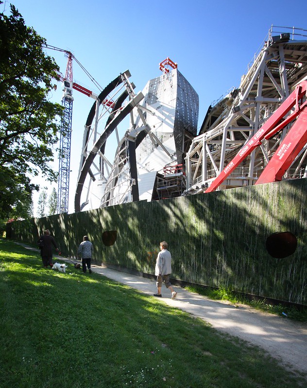
Fondation Louis Vuitton in Paris France by Frank Gehry (expected completion 2014). Per the Fondation's website:
Like a floating ship in the trees; wide opened to nature, the building imagined by Frank Gehry expresses the spirit of the Fondation Louis Vuitton pour la Création, ever in state of becoming. It was conceived to be continuously reinvented with the passage of exhibitions and events. In exquisite harmony with the environment, its interior and exterior spaces breathe as one.
*I inadvertently skipped a number in my last posting, hence the backtrack with today's archidose.

To contribute your Flickr images for consideration, just:
:: Join and add photos to the archidose pool, and/or
:: Tag your photos archidose

Monday, Monday

A Weekly Dose of Architecture Updates:

This week's dose features Mini-Studio in Mexico City, Mexico by FRENTEarquitectura:
this       week's  dose

The featured past dose is the Azteca Multimodal Transfer Station in Mexico City, Mexico by CC Arquitectos:
this       week's  dose

This week's book review includes three journals: Boundaries #3, City Limits #5, Log 24:
this week's book review

**NOTE: The next weekly dose will be 2012.05.29.**

american-architects.com Building of the Week:

BSA Space in Boston, Massachusetts by Hӧweler + Yoon Architecture:
this week's Building of the Week

Unrelated links are now found in the left sidebar and on My Diigo Bookmarks page.

OMA + MAI


OMA-MAI-1.jpg
[Photos by John Hill, unless otherwise noted]

Last week, a bunch of press folks squeezed into MoMA PS1's Performance Dome to listen to artist Marina Abramović, architect Shohei Shigematsu (of OMA's New York office), and others unveil the design for the Marina Abramović Institute for the Preservation of Performance Art (MAI) in Hudson, New York. The unveiling kicks off a fundraising effort on the part of the artist, who aims for an optimistic completion of the project in 2014. The design, by Rem Koolhaas and Shigematsu, reconfigures an old theatre-cum-tennis-center, preserving its exterior walls, balcony, and structure, and inserting new floors and spaces.

OMA-MAI-2.jpg

At first blush I thought the combination of a well-known artist and well-known architect added up to a lot of hype, but not necessarily a good architectural design. But after learning more about Abramović's art and OMA's design during the press conference, I gradually warmed up to it. The above study models indicate the basic parti of the design: a large central performance space is surrounded by smaller spaces. The more developed study model below (bottom right, above) makes it clear that some of the smaller spaces serve the large performance space -- the reused balcony, in particular -- but most of them work independently; the design's reality is somewhere between these two relationships, as will be seen.

OMA-MAI-3.jpg

The site plan below illustrates how the building Abramović purchased has a strong public presence in Hudson, overlooking a large open space. MAI is envisioned as another element in a string of public buildings that ring the open space and extend to other parts of the town. According to a press release, MAI "will host workshops, public lectures and festivals." But its bread and butter will be training people in the Abramović Method.

OMA-MAI-4.jpg

The artist explained her Abramović Method after showing a short trailer for the documentary The Artist Is Present, which is based on her show of the same name at MoMA in 2010. As the title indicates, Abramović was part of the exhibition, actually sitting in MoMA's large atrium gallery for hours each day, staring at museum-goers who sat across from her; many were moved to tears. It's obvious that her long-duration performances take discipline on the part of the artist, but it is less obvious that it requires the same (if to a lesser degree) from the viewer, who actually becomes part of the performance. The Abramović Method is her means of training people to have the right mindset and discipline to endure long-duration performances. This makes it sound like these performances are painful more than grueling, but given today's short attention spans and speedy communications, even the 2-1/2-hour period without a smartphone may be difficult for many.

OMA-MAI-5.jpg

To get back to OMA's design, the large performance space is centrally located for two reasons: first, the theatre/tennis courts were in the same location; and second, this flexible white-box space for up to 650 people is overlooked by every other part of the Institute, elevating it to be the most prominent and important space. In the model above, the bottom left corner -- the piece that juts from the building mass -- is the entrance, which includes a vertical gallery. From the entry, those attending a performance would go to the left, while those for training would continue straight and to the right; therefore a distinction between public and private is created, but each has views of central space.

OMA-MAI-6.jpg

Of the public and private spaces, the latter are easily the most interesting. The Abramović Method requires some traditional classroom-type spaces, but it also includes a levitation room, a crystal room, and a sleeping chamber; in the case of the latter, employees wheel trainees in custom wheelchairs -- somewhere between a traditional wheelchair and a cabana chair -- from elsewhere in the building (wherever the fall asleep) to the chamber. Considering that trainees don white lab coats, and that they eventually perform (like in Milan at PAC) for the public, I can only imagine a strange dynamic happening in the building between the public and private, between the curious and the immersed. The building "type" is a strange hybrid of a performing arts institution and a school, anchored by Abramović and her unique method. One can only imagine how the building would "work," but for some reason I think it needs to be a 24-hour institution, in order to truly embrace the long-duration performances the artist promotes.

OMA-MAI-7.jpg

This last illustration, a longitudinal building section below, shows the relationships of some of the smaller spaces to the central performance space. The idea is that a visit to the library or some other space gives a peek at the performance space, as well as views across to the other openings; therefore people watch each other watching the performance. A breakdown occurs between long-held distinctions between performer and viewer, both in the art and in the architecture. In that regard, OMA's design is simple yet completely appropriate to the complex task of turning Abramović's art and method into a building for the ages.

OMA-MAI-8.jpg
[Building Section | Image courtesy OMA]

Today's archidose #586

Here are a few photos of the Conrad Hotel in Beijing, China by MAD Architects, 2012. Photographs are by Willian Veerbeek, who has many more photos of buildings new and old in his Beijing/CN, 2012 set on flickr.

Conrad Hotel (MAD architects), Beijing / CN, 2012

Conrad Hotel (MAD architects), Beijing / CN, 2012

Conrad Hotel (MAD architects), Beijing / CN, 2012

Conrad Hotel (MAD architects), Beijing / CN, 2012

To contribute your Flickr images for consideration, just:
:: Join and add photos to the archidose pool, and/or
:: Tag your photos archidose