The Good Wife...All Over Again

A little over a year ago I blogged about a scene in CBS's The Good Wife in which a clip from Groundhog Day was inserted amongst original footage for the show. That Good Wife scene takes place somewhere within or near Chicago, but the Groundhog Day scene is set in Punxsutawney, Pennsylvania. Yet in reality the rest of the former's scene was actually shot in New York City (it looks like Queens, but I'm not sure), and the latter was actually filmed in Woodstock, Illinois, closer to the fiction of Good Wife than where the TV show is actually made. In both cases the filmed reality is being passed off as somewhere else. This isn't surprising to anybody who knows how TV and film or made, or to people that pay even a little bit of attention to moving images, but it still interests me.

nyc-dc1.jpg
[The Good Wife still | image source, @ 35m08s]

Some more of The Good Wife passing off one place for another came in Sunday's show, "Blue Ribbon Panel." Kalinda (left above) meets an FBI agent in what is supposed to be some sort of Fed cafeteria, but seeing it I knew it wasn't DC or Chicago. Since they shoot the show in New York City, my first thought was, "what kind of modern/contemporary space of that scale exists?" And my first answer was "MoMA." But that museum is not across the street from a neoclassical facade framed in such a manner. So what is? Well, the John Jay College of Criminal Justice by SOM, of course. The building across the street is the old IRT Powerhouse by McKim, Mead and White. Exhibit A:

nyc-dc2.jpg
[John Jay on left, IRT on right | image from Google Street View]

I think I've discovered a new drinking game.

D&B Q&A

Yesterday Designers & Books posted an Author Q&A with me about my Guide to Contemporary New York City Architecture. Previously D&B featured my book as part of their Notable Books of 2011, selected by New York Magazine's Justin Davidson.

db-qa.jpg

In addition to some insight on making the book, upcoming projects, and other things, check out the Q&A to see some pages from the book.

Today's archidose #571

42nd Street
42nd Street, originally uploaded by Wojtek Gurak.

Headquarters for 42nd Street -- a youth mental health charity -- in Manchester, England by Maurice Shapero, 2012. Read and see more about the project at Manchester Confidential.

To contribute your Flickr images for consideration, just:
:: Join and add photos to the archidose pool, and/or
:: Tag your photos archidose

Google Doodles Mies

Today Google celebrates Mies van der Rohe on what would be his 126th birthday with a doodle melding the Google name and Crown Hall at the Illinois Institute of Technology.

mies-126.jpg

Not surprisingly the curves of each letter are made orthogonal, squeezed into the gridded framework of the building. I could see other Mies projects working just as well -- the Farnsworth House, the Seagram Building, even the recently restored Tugendhat Villa -- but I think Google did a good job with Crown Hall. I especially like the way the letters respond to the transparency of the top half and the frosted are below it.

Monday, Monday

My weekly page update:

This week's dose features Coverage of Archaeological Ruins of the Abbey of St. Maurice in St. Maurice, Switzerland by Savioz Fabrizze Architectes:
this       week's  dose

The featured past dose is the Sachsenhausen Memorial in Oranienburg, Germany, by HG Merz Architekten Museumsgestalter:
this       week's  dose

This week's book review is Inspiration and Process in Architecture - Bolles Wilson (L):
this week's book review   this week's book review
(R): The featured past book review is BOLLES+WILSON: A Handful of Productive Paradigms by Julia Bolles-Wilson and Peter Wilson.

american-architects.com Building of the Week:

Yin-Yang House in Venice, California by Brooks + Scarpa Architects:
this week's Building of the Week

Some unrelated links for your enjoyment:
2012 Skyscraper Competition
"eVolo Magazine is pleased to announce the winners of the 2012 Skyscraper Competition."

Are you there Frank Gehry? It's me, Orla.
A new blog that "contains the rantings of a non-architect living with architects and surrounded by architecture."

The Great Lakes Century
"The Great Lakes Century is a pro bono initiative of SOM's City Design Practice...We found dozens of important efforts to clean and protect the Lakes and the St. Lawrence, but no comprehensive vision for their entire ecosystem. So we did what we do: took a comprehensive look at the natural setting, how unenlightened human hands had messed it up, and then created a set of strategic principles – to begin a broad-based, bi-national dialogue."

Designing New York's Future
A report from the City for an Urban Future. "New York City graduates twice as many students in design and architecture as any other U.S. city, but the city's design schools are not only providing the talent pipeline for New York's creative industries—they have become critical catalysts for innovation, entrepreneurship and economic growth." (PDF version of report.)

Today's archidose #570

IMG_6219-Edit.jpg
IMG_6219-Edit.jpg, originally uploaded by Brandon Shigeta.

Claremont University Consortium in Claremont, California by LTL Architects, 2011.

To contribute your Flickr images for consideration, just:
:: Join and add photos to the archidose pool, and/or
:: Tag your photos archidose

2012 Emerging Voices

Last night I attended the third lecture (of four) in the Architectural League's 2012 Emerging Voices, with presentations by Dwayne Oyler and Jenny Wu of Oyler Wu Collaborative (Los Angeles), and Jinhee Park and John Hong of SsD (New York, Boston, Seoul). The event was held in the 
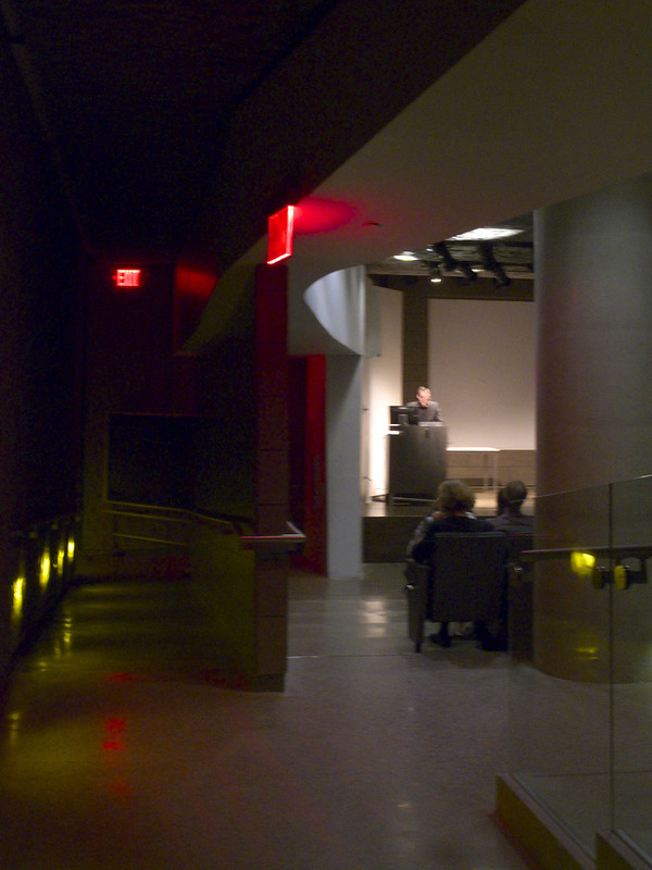
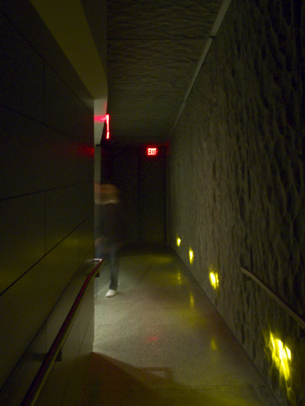
Frederick P. Rose Auditorium in the basement of The Cooper Union's 41 Cooper Square, designed by Morphosis with local architect Gruzen Samton.

Frederick P. Rose Auditorium

Oyler and Wu's talk was rather refreshing, namely in explaining their decision not to do something new with each project and their reliance on hand drawing and modeling in association with computer methods. Focusing on the former, four "iterative" projects allowed the duo to explore the design and fabrication (they have built all of their designs to date) of aluminum tube structures. Investigations via an installation, a storefront exhibition space, and a temporary stair culminated in last year's reALIze piece carried out with artist Michael Kalish. This is not to say the first three projects were not important or merely stepping stones, but the lessons learned in each were applied to subsequent projects. Since reALIze, they have carried out the large-scale Graduation Pavilion at SCI-Arc, where they both teach, and are working towards realizing a 16-story project in Taiwan. The aluminum tubes way be gone (for now), but each of their projects carries with it some formal consistencies, namely a density and layering of lines.

Frederick P. Rose Auditorium

One of the projects Oyler and Wu touched upon was a facade that rippled like flowing fabric. (The project is not on their web page, but here is 
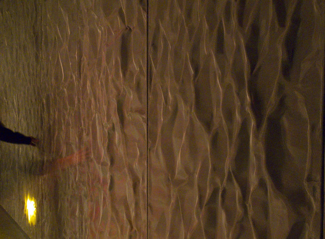
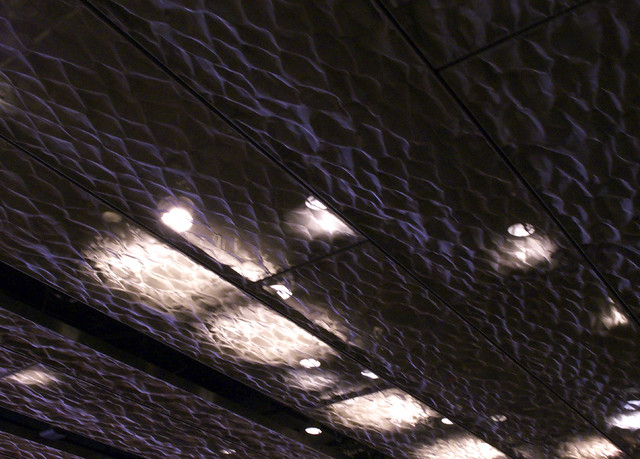
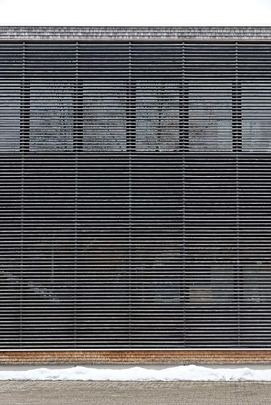
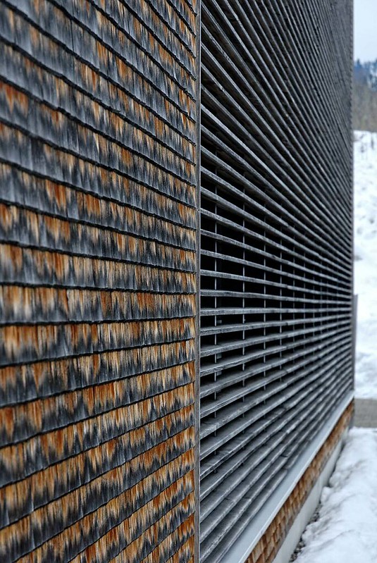
an image at Arch Daily.) The metallic skin, albeit only in rendered form, very much recalled the ceilings and walls of the Rose Auditorium, represented by my four photos here. Thom Mayne used a crumpled looking metallic fabric for these surfaces. As the top photo attests, the material begged to be touched. Given that the material choice is partly used for acoustic reasons (the irregular surfaces should help sound bounce around the space effectively), it's interesting to see the same material on the ceiling as well as the wall. Of course I'm thinking of this relative to acoustical ceiling tiles, which are so easy to damage they can't be used on walls where people can touch them. Seeing a TV show once where an interrogation room in a police station used acoustical tile on the walls, the architect in me just had to laugh, thinking of how they wouldn't last a day in that application, especially in such a context.

Frederick P. Rose Auditorium

Moving on to SsD (originally it stood for Single Speed Design, but now it's just the letters sans explanation), their presentation was a bit choppy but after Oyler Wu it was a little bit of a jolt to see some real buildings, like houses and museums. SsD has built considerably for such a young office, yet the simplicity and consistency of their portfolio had me thinking. Recently I've encountered the idea of what makes Japanese architecture, well, Japanese; this happened both in attending a lecture and in reading a magazine. Even without defining anything, it's hard to deny that there is something immediate that makes one realize a building is by a Japanese architect, be it located in Japan or elsewhere. Yet taking in each SsD project, I couldn't help but think that their architecture seems very Japanese; maybe not in all cases (these are the designers of the 
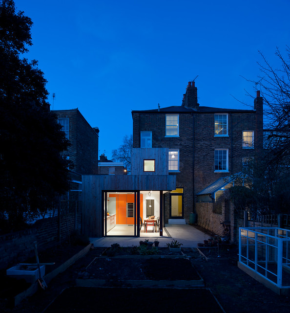
Big Dig House, after all) but in their more significant works, especially the White Block Gallery in Korea. I don't think this is a defining trait of their actually quite varied work, but it was curious that a certain argument rattling around my head lately -- that Japanese architecture is distinctively different from others -- was contested and complicated by the US/Korea office's presentation.
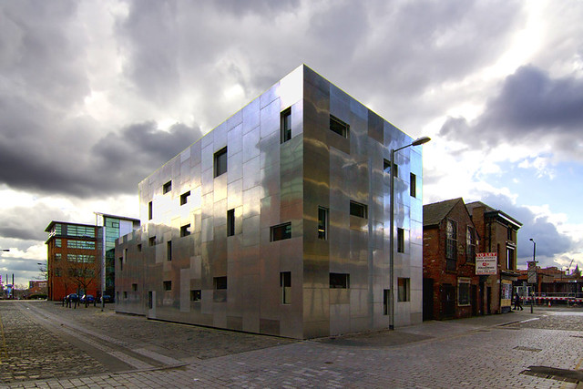
Frederick P. Rose Auditorium

Obscure Urban Design Reference

Anybody recognize this cartoon capture?

urban-design-book.jpg

Of course it's from 2004's The Legend of Frosty the Snowman, "told and sung by Burt Reynolds." The above character, pictured at the end of the cartoon, is Sara Simple, one of the kids of Evergreen, where "magic, silliness, and nonsense of all kinds are strictly against the rules." Earlier she asserts to her mom, "I don’t want to be a princess—I want to be an urban planner!" Obscure, indeed.

Today's archidose #569

Here are a couple projects in wood.

First, Schreinerei Feuerstein in Oberstaufen, Germany by Architekten.3P, 2007. Photographs are by Frank Stahl.

Fenster Feuerstein, Oberstaufen

Fenster Feuerstein, Oberstaufen

Fenster Feuerstein, Oberstaufen

Fenster Feuerstein, Oberstaufen

Fenster Feuerstein, Oberstaufen

And second, the Seaford Life Saving Club in Seaford, Victoria, Australia by Robert Simeoni Architects, 2008. Photographs are by Christopher Brown. For more information on the building visit Australian Design Review.

Seaford Life Saving Club

Seaford Life Saving Club

Seaford Life Saving Club

Seaford Life Saving Club

Seaford LSC

To contribute your Flickr images for consideration, just:
:: Join and add photos to the archidose pool, and/or
:: Tag your photos archidose

Smatterings

Here is one of my occasional posts catching up on some of the information that trickles -- and sometimes rushes -- into my inbox.

OTTO:
*otto.jpg
Like a cool Corbis, OTTO is "an architectural and design photography agency dedicated to licensing the work of preeminent architects and designers from around the world as captured by master contemporary photographers. Founded by Thea Vaughan and Bill Hannigan [formerly of Corbis], OTTO is committed to delivering images of iconic architecture and design." Some of the select photographers include Michael Moran, Peter Aaron, Richard Barnes, Scott Frances, Ty Cole, and Floto Warner. The archive is young but ever growing. Registration is free and exploring the site is easy. A simple and fast interface allows for browsing by photographer, keyword searches, or viewing individual projects. I've often received requests from stock photo sites to feature their images, but given that my blog, like most of the architectural press, highlights individual buildings, those requests seemed misguided. OTTO strives to fill a niche that wants to present the best in architecture and its representation.

SpruceBox:
*sprucebox.gif
Currently in beta, SpruceBox is a website that allows people to modify certain surfaces and components in a variety of views of kitchens and baths. The above kitchen is but one of many kitchen layouts with variables for different elements. Other kitchens, for example, allow more components to be played with, not just floors, countertops, and cabinets. Users pick the closest approximation to their current or dreamed kitchen or bath and then cycle through the different components. As can be seen the aesthetic is simple and modern. Ultimately the website is a means of enticing people towards modern yet somewhat affordable solutions for these spaces. I could see it being helpful to generate not just renderings but cut sheets to accompany them, giving the user a list of materials and fixtures they can take to a professional. Most people can't afford a modern house, but that doesn't mean they can't have a modern kitchen or bath. (A similar app is iGranite, which is not really modern and is geared towards a specific manufacturer's items -- granite countertops -- but it does enable users to take or upload photos and see various alternatives in an actual space, a direction SpruceBox might consider in the future.)

CCA's 2012 Curatorial Opportunities Program:
*cca-opp.jpg
[Philippe Rahm. Interior Weather installation made for the CCA exhibition environ(ne)ment. 2006. Presented at Manifesta 7, 2008]
"For the second year the CCA offers two curatorial opportunities: the Young Curator Program and the Power Corporation of Canada Curatorial Internships Program." [PDF links] Deadlines are April 27, 2012.

New York CityVision Competition:
*ny-cityvision.jpg
"CityVision Architecture Competition is an annual competition held by the homonymous magazine of architecture CityVision Magazine that invites architects, designers, students, artists and creatives to develop urban and visionary proposals with the aim of stimulating new ideas for the contemporary city. ... New York CityVision is the fourth international ideas competition launched by CityVision. The competition wants you to imagine New York in its future if the manipulation of the urban context and its architectural objects, joined with its inhabitants, will be influenced by SPACE and TIME. The New York ideas will be judged by an international jury which will have as president Joshua Prince-Ramus, founder of the office REX and again Eva Franch i Gilabert, Roland Snooks, Shohei Shigematsu, Alessandro Orsini and Mitchell Joachim, all of whom are distingueshed [sic] by the large experimentation willingness in their work."

A video feature of Van Alen Books on Great Spaces:

Some commentary from Delaine Isaac on one of the city's treasures.

Let's Go Bowling

Michelangelo is oft quoted as saying, "Every block of stone has a statue inside it, and it is the task of the sculptor to discover it." A contemporary version of this statement, applied to artist Eddy Sykes, would revise the first part to say, "Every bowling ball has an architecture book inside it..."

Sykes_SMLXL_1.jpg.jpg
Sykes_SMLXL_2.jpg.jpg
[S,M,L,XL | image courtesy the artist]

Eddy Skyes' Trophy Series: book as object is described as:
"An ongoing series of sculptures exploring the notions of trophy and information, Trophy appropriates the Brunswick 'Black Beauty' bowling ball. Each ball is meticulously hand carved into the seminal architectural 'Big game' trophy, i.e., the 'super books' of Mau, Koolhaus, Corbu etc."

Today's archidose #568

Here are a few photos of the Endesa Pavilion at the Olympic Port of Barcelona, designed by the Institute for Advanced Architecture of Catalonia (Iaac) with the support of Endesa. The project is part of the Smart City BCN Congress, 2011. Photographs are by aitor estévez.

solar housing

solar housing

solar housing

To contribute your Flickr images for consideration, just:
:: Join and add photos to the archidose pool, and/or
:: Tag your photos archidose

Tuesday, Tuesday

My weekly page update, a little late this week:

This week's dose features La Lira in Ripoll, Spain by RCR Arquitectes:
this       week's  dose

The featured past dose is the Pedestrian Bridge over the river Carpinteira, Covilhã, Portugal by João Luís Carrilho da Graça:
this       week's  dose

This week's book review is Five North American Architects: An Anthology by Kenneth Frampton (left):
this week's book review   this week's book review
The featured past book review is The Evolution of 20th Century Architecture: A Synoptic Account by Kenneth Frampton (right above).

american-architects.com Building of the Week:

219 West/Subcat Studios in Syracuse, New York by Fiedler Marciano Architecture:
this week's Building of the Week

Unrelated links will be back next week.

Today's archidose #567


Buckingham Road residential refurbishment and extension in East London, England by Moxon Architects, 2011. See many more shots of the project in Andy Matthew's flickr set.

To contribute your Flickr images for consideration, just:
:: Join and add photos to the archidose pool, and/or
:: Tag your photos archidose

Fill the Gap

Yohji Yamamoto
[Montage of north elevation and gap, February 2009]

Previously I posted a couple times about the Yohji Yamamoto store designed by Japanese architect junya.ishigama + associates located just west of the Meatpacking District in Manhattan. In the summer of 2010 I noticed that the store was closed. At the time I was working on my book and considered keeping the project in it, even though the building's future was uncertain; I was smitten with the gap that the architect carved through the old brick building (above). Eventually I left it out of the book, and I'm glad, based on what I saw yesterday.

Yohji Yamamoto
[Western tip, February 2009]
1 Gansevoort Street
[Western tip, March 2012]

The first thing I noticed was the darker glass. (No, the brick didn't get darker; that's just different cameras, weather, and Photoshop.) Previously the store was very transparent, stemming from the pencil-point plan of the store and the clear, low-iron glass. Apparently the new tenant (not sure who it is as I failed to jot it down and can't find it online) didn't like it, so they added a dark tint to the glass.

1 Gansevoort Street
[Western tip and south elevation, March 2012]

I thought the tinted glass was no big deal, but then I saw the sealed up gap:

1 Gansevoort Street
[North elevation, March 2012]

NOOOO! That was the best part! Sure, it was unnecessary from an urban design point of view -- a through-block connection isn't needed so close to the tip -- but it was great because it was so unexpected. And technically it meant access to the store happened from the new alley, leaving the brick facades free of doors. Now there are two doors, one on the north and one on the south.

1 Gansevoort Street
[South elevation, March 2012]

I'll admit that whoever filled in the gap for the new tenant paid attention to the building they were given. The brick wall between the new entry and the tip remains, now free of glass. The new ceiling is on the same plane as the ceiling to the west; even the downlights continue in the same manner. The skylights are a nice touch in the space that displays some clothes but otherwise serves as a place for the cash register. And the top of the new doors align with the top of the windows, and the top of the panel stops at the coping.

But the new elevations that fill the gap add something that was not in the original: frames. Ishigama took an old building and scaled it down to two materials: brick and glass (okay, three if you count the cast stone coping); the latter was set into the former with silicone joints between panes. This means that the metal frames and panels above the door are a completely new expression. This isn't a bad thing, but it is not pulled off successfully. The two infill pieces try to be simple but they look like a cheap and utilitarian storefront system aligning with the window headers and coping, yet otherwise lacking the rigor of the previous design. Unfortunately the result is a building that people will walk by and hardly notice, unlike the previous incarnation.

Ordos 100 Remix

Remember Ordos 100? You know, that project in Inner Mongolia master planned by Ai Weiwei where 100 architects chosen by Herzog & de Meuron designed 100 villas. It was announced amid lots of hype back in 2008, but nothing has materialized on that patch of desert. Ordos City has seen the Ordos Museum by MAD Architects and rows of bland housing, but no cutting edge villas.

So what could be better than a remix of a recent Ai Weiwei documentary on the project? That is just what Paul D. Miller aka DJ Spooky That Subliminal Kid has done. Here's a trailer:


And here's the Ai Weiwei documentary (included in the 2012 International Film Festival Rotterdam) in its entirety:


The description from DJ Spooky's YouTube channel regarding the remix:
For DJ Spooky film lends itself to appropriation and collage, much like the urban landscape. DJ Spooky has taken the concept of the Situationist concept of "psychogeography," to arrive at a kind of contemporary "dérive" - an unplanned journey through a landscape, usually urban, where an individual travels where the subtle aesthetic contours of "free" space and time.He has applied that concept to the original version of the film and taken the position of "Director as DJ" to remix the Ordos 100 project.
(via Javier Arbona)

Saving Rudolph, Once Again

One of the buildings on the World Monument Fund's 2012 Watch List is the Orange County Government Center in Goshen, New York, designed by Paul Rudolph and completed in 1970. It seems like at least one of Rudolph's buildings is slated for demolition each year, raising the ire of modern architecture preservationists, but often proving unsuccessful in halting demolition.

Having been plagued by leaks and poor maintenance, the building has been closed and offices relocated since Hurricane Irene hit last September, when it was flooded and the structure was damaged. County Executive Edward Diana tried unsuccessfully in 2010 to have the building demolished and replaced by a new one, but those demolition plans have been renewed in light of the recent closure.

Here is the Rudolph-designed Government Center:

rudolph-orange1.jpg
[Orange County Government Center by Paul Rudolph, 1970 | image source]

And the proposed replacement, architect unknown:

rudolph-orange2.jpg
[Orange County Government Center proposal replacement, 2012 | image source - PDF link]

On March 5, Diana unveiled a 5 proposal (PDF link) in his 2012 State of the County Address for a New Government Center. The presentation contends that the new 3-story building, which increases the size of their facilities by 22,000sf, would cost $75 million (the 2010 proposal was $114 million, one of the reasons it was unsuccessful). It further contends that renovating the Rudolph building and creating a 22,000-sf addition would cost between $67 million and $77 million.

So given these similar price tags and the very dissimilar designs, the issue seems to be style rather than money. Sure, the presentation does pad its myriad economic stats with lines about creating jobs and drawings showing the new building four feet above the flood plain, but renovating Rudolph's building would also create jobs and the aerials in the presentation don't jibe with the site section, so I'm skeptical about the proposed building being higher than the existing one. So, like every annual Rudolph demolition threat, it comes back to the usual fight over modern versus traditional, new versus old, etc.

I've never been a huge fan of Paul Rudolph's architecture, and photos of the Orange County Government Center make it clear why people aren't in love with the building, be it now or four decades ago when it opened and called a "monstrosity." But glimpses inside reveal some amazing, naturally lit spaces that I think beg to be saved. There's no way the neo-traditional proposal will have any civic spaces on par with what they have, ones that residents of Orange County can be proud of.

rudolph-orange3.jpg
[Orange County Government Center by Paul Rudolph, 1970 | image source]

For more information on the demolition threat to the Orange County Government Center visit the World Monuments Fund, DOCOMOMO US/New York Tri-State, Taxpayers of Orange County, and of course the Paul Rudolph Foundation. The third and last of three public forums organized by the Taxpapers of Orange County takes place on March 25 in Port Jervis.