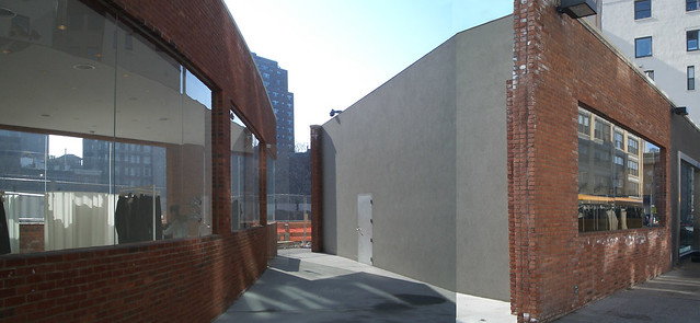
[Montage of north elevation and gap, February 2009]
Previously I posted a couple times about the Yohji Yamamoto store designed by Japanese architect junya.ishigama + associates located just west of the Meatpacking District in Manhattan. In the summer of 2010 I noticed that the store was closed. At the time I was working on my book and considered keeping the project in it, even though the building's future was uncertain; I was smitten with the gap that the architect carved through the old brick building (above). Eventually I left it out of the book, and I'm glad, based on what I saw yesterday.
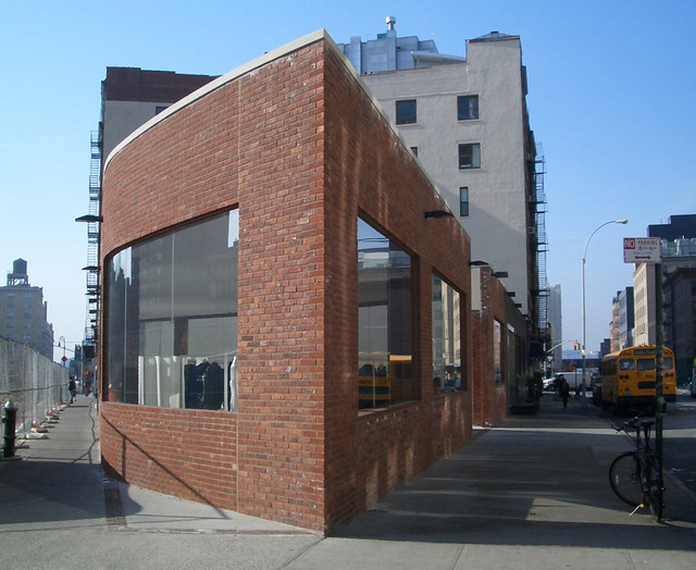
[Western tip, February 2009]
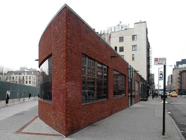
[Western tip, March 2012]
The first thing I noticed was the darker glass. (No, the brick didn't get darker; that's just different cameras, weather, and Photoshop.) Previously the store was very transparent, stemming from the pencil-point plan of the store and the clear, low-iron glass. Apparently the new tenant (not sure who it is as I failed to jot it down and can't find it online) didn't like it, so they added a dark tint to the glass.
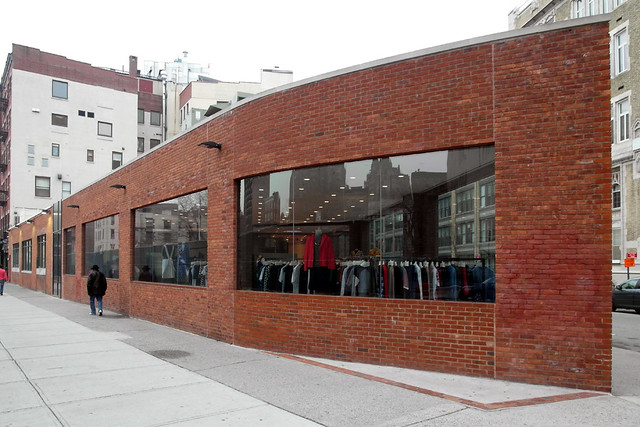
[Western tip and south elevation, March 2012]
I thought the tinted glass was no big deal, but then I saw the sealed up gap:
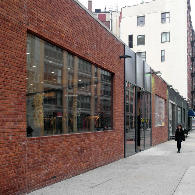
[North elevation, March 2012]
NOOOO! That was the best part! Sure, it was unnecessary from an urban design point of view -- a through-block connection isn't needed so close to the tip -- but it was great because it was so unexpected. And technically it meant access to the store happened from the new alley, leaving the brick facades free of doors. Now there are two doors, one on the north and one on the south.
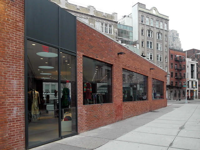
[South elevation, March 2012]
I'll admit that whoever filled in the gap for the new tenant paid attention to the building they were given. The brick wall between the new entry and the tip remains, now free of glass. The new ceiling is on the same plane as the ceiling to the west; even the downlights continue in the same manner. The skylights are a nice touch in the space that displays some clothes but otherwise serves as a place for the cash register. And the top of the new doors align with the top of the windows, and the top of the panel stops at the coping.
But the new elevations that fill the gap add something that was not in the original: frames. Ishigama took an old building and scaled it down to two materials: brick and glass (okay, three if you count the cast stone coping); the latter was set into the former with silicone joints between panes. This means that the metal frames and panels above the door are a completely new expression. This isn't a bad thing, but it is not pulled off successfully. The two infill pieces try to be simple but they look like a cheap and utilitarian storefront system aligning with the window headers and coping, yet otherwise lacking the rigor of the previous design. Unfortunately the result is a building that people will walk by and hardly notice, unlike the previous incarnation.