
[Looking southwest across Prince and Greene Streets | All photos by John Hill]
On Tuesday evening, Camper unveiled its new Shigeru Ban-designed store on the corner of Prince and Greene Streets in Soho. The store maintains the existing stone exterior walls, enlarges the openings between columns, presents a new interior, and caps it all with a pitched roof made from the Japanese architect's signature cardboard tubes. It's alternately whimsical and serious, designed to surprise people in a number of ways.
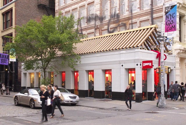
[Looking west]
A glance at Google Street View reveals the existing condition: a one-story PoMo building located on the southwest corner of the intersection (catercorner to the Apple Store Soho) next to a party wall mural that echoes the area's cast iron architecture. The new roof gives the building a stronger presence than before, partly from the jarring contrast between the cardboard tubes and the surroundings. Note the inside of the store between the stone columns (above photo); the red wall with white letters is specially designed to be seen from the corner, as will be revealed below.
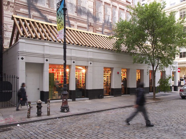
[Looking northwest]
Yet when approaching the building from the south (photo above), the view into the store is different. Instead of a red wall, passersby see shelving.
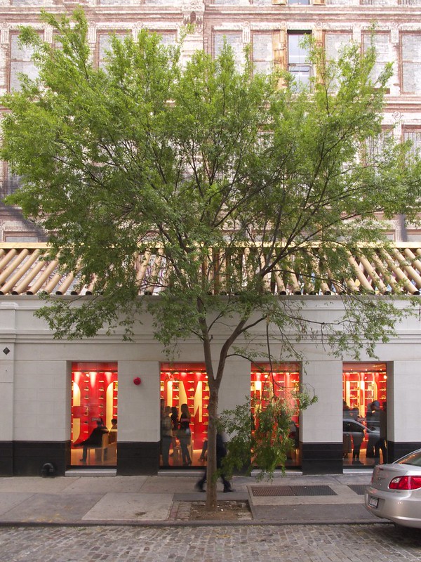
[The east elevation]
Seen straight across Greene Street (photo above), these two conditions -- white-on-red graphic and shoe storage -- start to blur together.
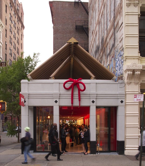
[The north elevation]
The below photo shows close-ups of the store's west wall. Ban has angled the shelves for the shoes so they are invisible from the intersection; one only sees the red wall emblazoned with CAMPER. Everything else in the otherwise open-plan store follows this diagonal and the red/white color scheme, such as the stripes on the floor and the serrated ceiling. The above photo reveals (esp. when seen large) the mirror covering the store's south wall; this surface reflects the shoes so both conditions can be seen simultaneously, as well the scale of the space is that much greater.
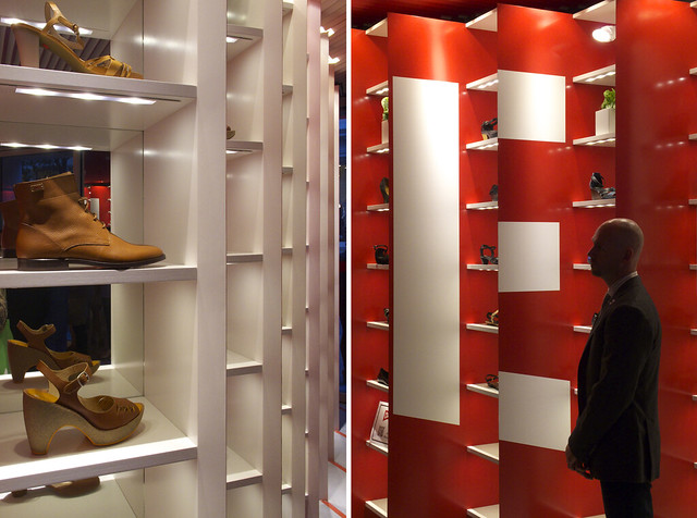
[A montage of the west wall: (L) looking north and (R) looking south]
The interior is a simple yet effective device that merges graphic branding with functional storage. In a sense it is very Japanese: it is both/and, as opposed to either/or; it is a symbiotic balance of two concerns. The space's east wall (photo below) also strengthens the space, making the stone exterior disappear and opening up the store to the exterior via sliding glass walls. Unfortunately the cardboard-tube roof is not visible from inside. A few skylights are cut into the otherwise solid ceiling plane, but their red aluminum fins below glass don't give a clear view of the roof. This feels like a missed opportunity, but one that most likely responds to fire codes and other practical concerns. No wonder the roof is called a "temporary art installation" in a press release for the store. Whatever the case, the store suffers from a split personality. Yet their mutual existence makes each stronger and results in something fresh in Soho's historical Cast Iron District.
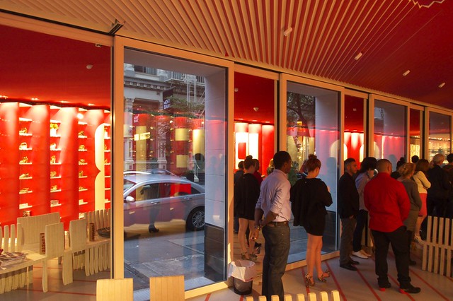
[The inside of the east-facing elevation]