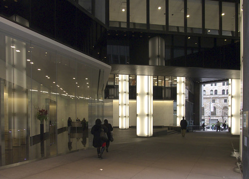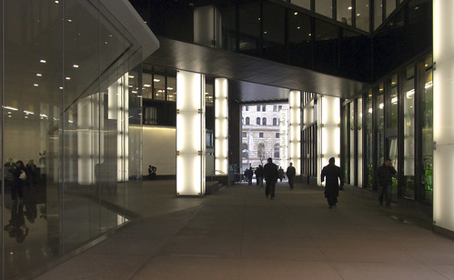
Cutting diagonally from John Street (above) to the intersection of William and Platt Streets is the covered pedestrian space of 100 William Street. Dating back to 1974, it is "the first covered pedestrian space built under the covered pedestrian space bonus provisions of the Zoning Resolution," according to Jerold S. Kayden in his survey of New York City's Privately Owned Public Spaces. Designed by Davis Brody with Emery Roth and Sons, the building has a muted facade of black slate panels alternating with horizontal windows, but the POPS was more theatrical with numerous reflections coming from surfaces like the chrome column covers.

[L: The previous condition (image source) | R: "Airstream meets Chia Pet" installation by Kevin Kennon Architects (image source)]
In between the gaudy chrome and its current incarnation of backlit-glass columns in a more simplified and transparent space was a retail installation by Kevin Kennon Architects, which inserted a bit of whimsey (are those over-sized pigeon spikes on top?) but was temporary. The current design is attributed to Rogers Marvel Architects in this CB#1 document (PDF, page 4), though the project is nowhere to be found on the architect's website. Regardless it looks like a Rogers Marvel design to me, given its level of detail and their track record with public spaces.
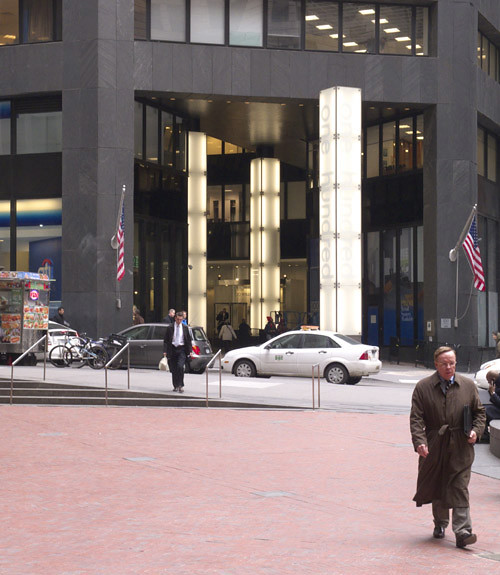
Above is the view across William Street, looking northeast. A new pylon is emblazoned with the building address, branding the space that features a handful more glowing column covers. Below is the view from John Street, looking southwest. One striking aspect of the design comes across here: the covered pedestrian space is highly transparent. People moving through the space have glimpses into the lobby at left, not to mention up into some of the office spaces on the second floor.
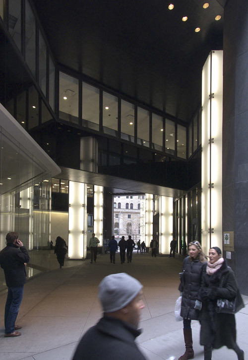
Looking again from the intersection of William and Platt Street (below), the same glimpses up into offices can be seen. Of course, this is not new to the space; it is part of the original design. But the new design accentuates the transparency of what borders the space, rather than competing with it like the chrome.
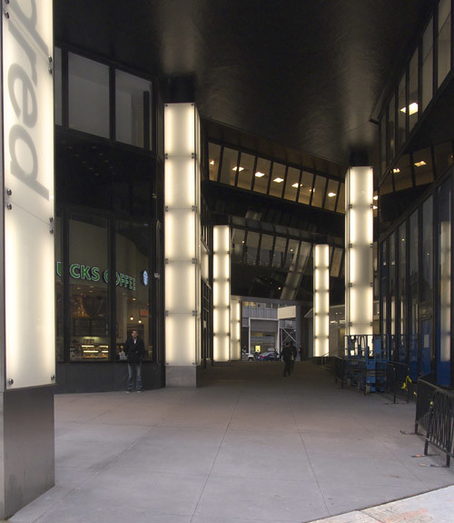
This transparency is most pronounced at the 100 William Street lobby (bottom left, again looking from John Street), which features tall ultra-clear, butt-glazed glass. The lobby is basically put on display, as an almost seamless part of the pedestrian space. The CB#1 document indicates that the renovation removed an escalator to the cellar (a TKTS booth used to be located in that lower level), so the whole pedestrian space is now at grade. The whole may not result in "a vastly improved amenity for the public," as the same document contends -- retail is minimal and no seating is provided -- but it makes for a nice diagonal walk, especially from John Street towards the rusticated Federal Reserve Bank of New York.
