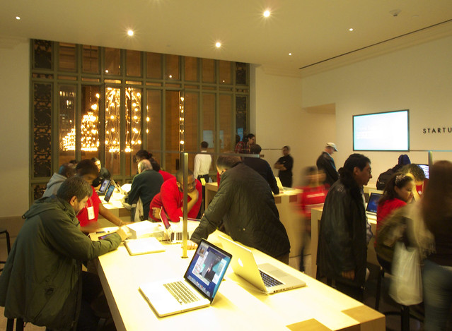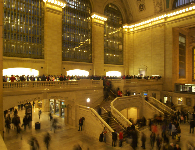
On Friday the Apple Store in Grand Central Terminal opened. It occupies the east balcony, a portion of the north balcony, and attached smaller spaces, all adjacent to the station's main concourse. It's a great setting for a store, one that architect Bohlin Czywinski Jackson responded to with a restrained design that does very little beyond inserting furniture into the various spaces.

The top two photos are looking from the north balcony to the east balcony, from the Genius Bar to the main floor for the store. It's quite apparent that very little happens above the heads of the crowd. If we leap over to the east balcony (below), the familiar Apple store tables can be seen occupying the space, most capped by slender lights at about head height. These lights are a foil to the bulky yet clean-lined tables, and they create a datum of sorts that connect the various spaces together. But with crowds -- and the employees as well, all 350 of them! -- the lights fade away.
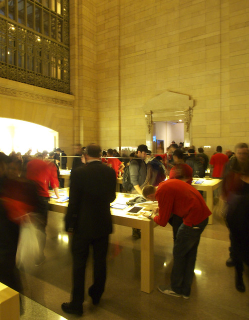
A close-up of one of the tables (below) shows the simple and slender design of the T-shaped light fixtures, barely visible in the center of the table. This image also illustrates how the tables are located in relation to the context; this one is on axis with the opening beyond.
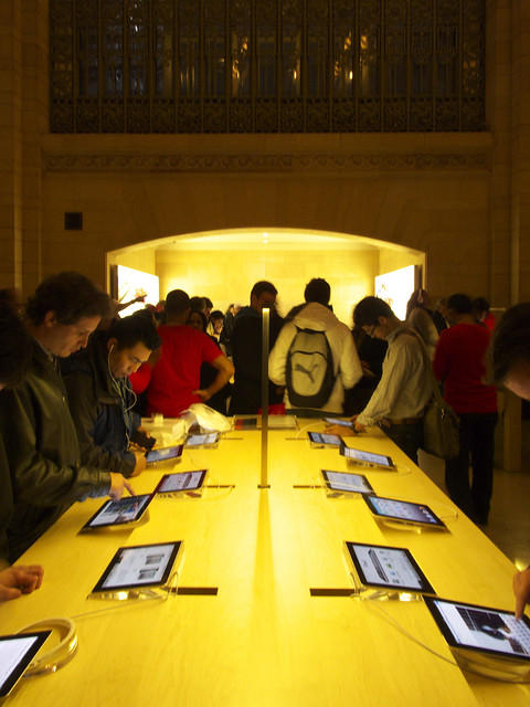
A portal at the south end of the east mezzanine (below) is a strong draw, owing to the perception of vertical movement and the white walls beyond.
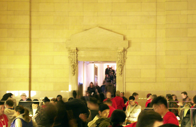
The portal leads to a couple rooms, including one devoted to accessories. This room looks through a glass wall to Vanderbilt Hall. It's a small space but one made all the more impressive by the presence of this glass screen. Here and elsewhere in the store, it's clear that BCJ not only respects the architecture of Grand Central Terminal, but appreciates it enough to celebrate it at every opportunity.
