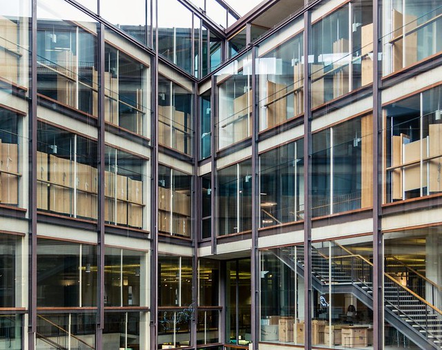
"The Most Important Room in the World"
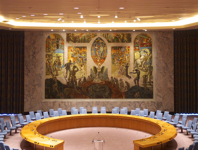
The unveiling of the restored UN Security Council Chamber, what's called "the most important room in the world," happened earlier this evening. Below are some photos I took and some brief explanation of the original project and the ceremony.
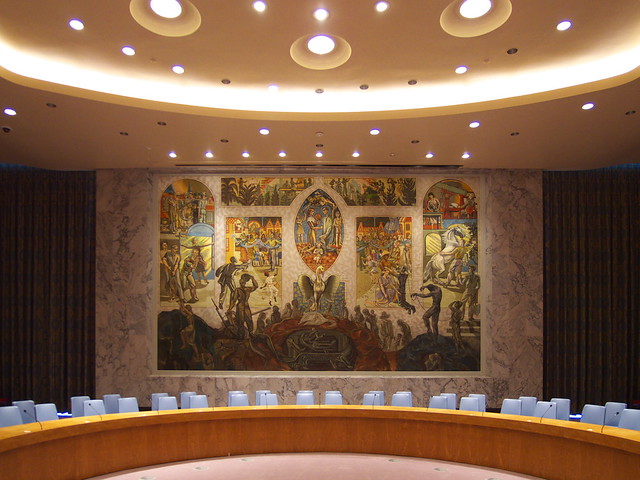
The room, situated within the United Nations Conference Building, was presented to the UN as a gift from Norway in 1952. It was designed by architect Arnstein Arneberg, though most of one's attention is drawn to Per Krohg's mural that graces the east wall and serves as a backdrop for the members seated at the circular table.
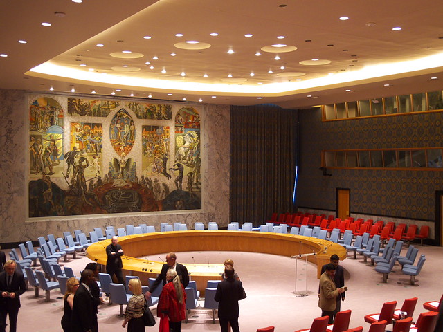
Arneberg designed the room to embody the Norwegian art and culture of the time, though he also wanted a "character so neutral that it could withstand the test of time." While hardly timeless, the combination of modern architecture, a figurative mural, modern furnishings, and richly patterned wallpaper is a successful one that manages to exude calm and respect.
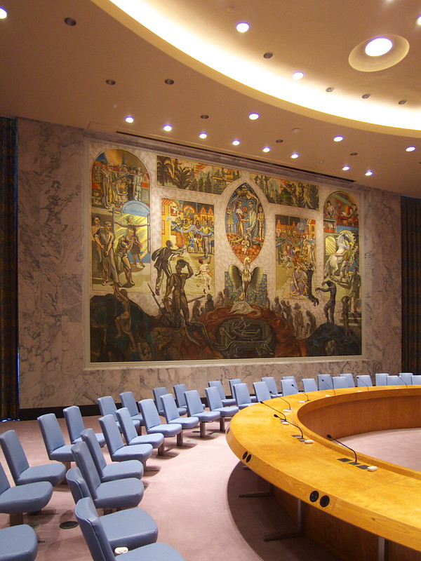
One detail pointed out both in the informative pamphlet and during the Norweigan Minister of Foreign Affairs' address is how the ashtrays (next to the microphones on the circular table, above) have been exchanged for data outlets; the detail is the same but the function under the black cover conveys the changes that have taken place in the last 60 years, or more accurately the last decade.
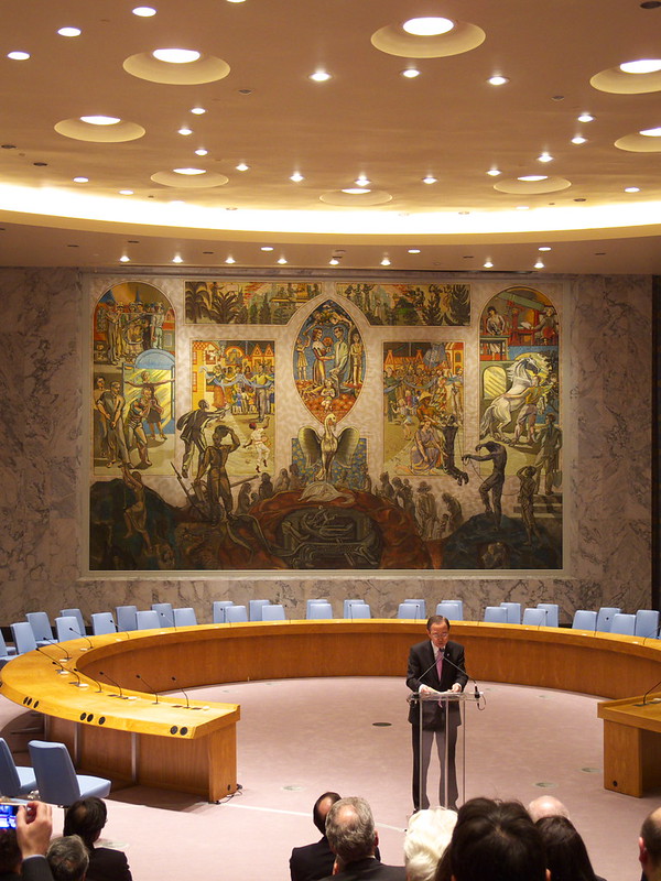
UN Secretary-General Ban Ki-moon (below) addressed the packed house, saying (I think rather nicely and accurately) that "the room speaks to us in a language of dignity." Espen Barth Eide, the Norweigan Minister of Foreign Affairs, said later that the room is "an inspiring space for carrying out the UN's core tenets of peace and security."
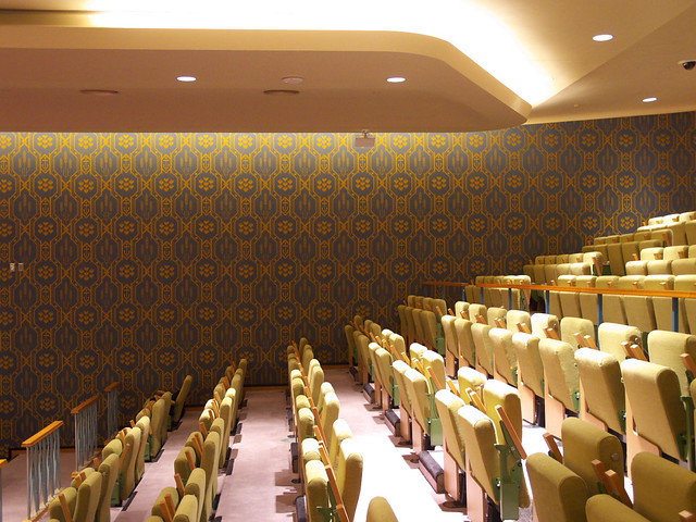
Overlooking the circular table and large mural are about 20 rows of seats, half of them fixed red seats (the same as the ones flanking the circular table, visible in the second and second-to-last photos) and half of them folding green seats (below). In this upper section of the space the Damask wallpaper designed by Norway's Else Poulsson has a really strong presence. The original wallpaper was removed and remade as part of the restoration; one piece of the old wallpaper was made into a tie and given to Ban Ki-moon as a gift.
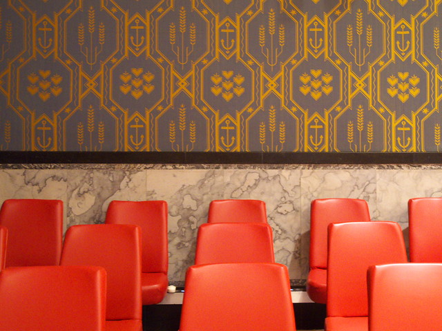
This last view of the UN Security Council Chamber shows the seats that flank the circular table. For some reason the photo does not capture the greenness of the wallpaper, but I think it reveals how the furnishings and materials manage to work together, even as the combination of modern, marble, and regular pattern blends some usually irreconcilable design features.
After the ceremony there were some drinks in the North Delegate's Lounge (below). I'm including this photo because it shows how many people turned out for the unveiling, and because of the view of the residential towers in Long Island City, Queens, thankfully filtered by some decorative hangings in front of the glass.
Monday, Monday
A Weekly Dose of Architecture Updates:
This week's dose features the Coach Flagship, Omotesando in Tokyo, Japan, by OMA:
The featured past dose is McCormick Tribune Campus Center in Chicago, Illinois, by OMA:
This week's book review is Diller Scofidio + Renfro: Architecture after Images by Edward Dimendberg (L):
(R): The featured past book review is Scanning: The Aberrant Architectures of Diller + Scofidio edited by Aaron Betsky.
: : : : : : : : : : : : : : : : : : : : : : :
American-Architects Building of the Week:
Iowa Utilities Board – Office of Consumer Advocate in Des Moines, Iowa, by BNIM:
The Vienna Model
Tomorrow, Tuesday April 16, is the opening of The Vienna Model, an exhibition at the Austrian Cultural Forum New York curated by Wolfgang Förster and William Menking. The opening includes a panel discussion at 5pm (RSVP required) and a opening reception (no reservations required) following at 6pm. See below for more information on the exhibition that runs until September 2, 2013.
From the ACFNY exhibition page:
This exhibition at the Austrian Cultural Forum New York presents a survey of public housing design in the Austrian capital of Vienna curated by Wolfgang Förster and William Menking. The exhibition will feature 36 case studies in Viennese public housing, accompanied by a responsive series of images of artworks curated by the Austrian collaborative duo Sabine Bitter and Helmut Weber.
The City of Vienna has achieved extraordinary milestones with regard to public housing: today, about 60% of the Viennese population lives in municipally built, owned, or managed housing, and the city is clearly in control of the housing market. This stands in stark contrast to the United States, where, in most cases, the private market is the provider of housing and is often even relied upon to rehabilitate existing neighborhoods and create new communities. Vienna’s housing model contributes to a tangible positive impact; for the past four consecutive years, Vienna topped the Mercer “Quality of Living” survey as the city boasting the world’s highest quality of life in the world, was ranked second in The Economist’s 2012 “World’s Most Livable City”, and number eight in Monocle’s 2012 “World’s Most Livable Cities”.
This successful model dates back to the days of “Red Vienna”, in the early 20th century, when the socialist government took an active interest in designing for the masses. That interest has since evolved into a housing-policy that has produced works by a host of prolific architects and studios over the years, such as those of Josef Hoffmann, Adolf Loos, Richard Neutra, and Margarete Schütte Lihotzky.
The projects featured in The Vienna Model are characteristic for contemporary Viennese public housing trends, some little-known outside the city: The Kabelwerk Estate, which involved turning the grounds of an old electrical cable & wiring factory into an entirely new urban area (completed in 2007, Hermann & Valentiny & Partners, Mascha & Seethaler, Schwalm-Theiss-Gressenbauer, Martin Wurnig, pool Architektur, Werkstatt Wien Spiegelfeld, Holnsteiner & Co.). Other examples include an Inter-ethnic housing complex (Peter Scheinfinger and Partners, 1998-2000), Bike City (königlarch architects, 2005 - 2008), and the Sargfabrik (BKK-2, Johnny Winter, 1996 - 2001), a former coffin manufacturing plant turned into a housing complex: this project was planned by a residents’ group in Vienna’s densely built-up fourteenth district, and has since received international acclaim for its outstanding architecture as well as its social concept of introducing a new communal infrastructure into a low-profile urban area.
Today's archidose #667
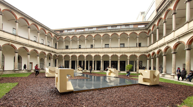
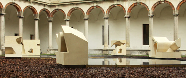
Here are some photos of Steven Holl Architects' INVERSION, part of INTERNI's Hybrid Architecture exhibition at FuoriSalone 2013 in Milan, photographed by Asli Aydin.
To contribute your Flickr images for consideration, just:
:: Join and add photos to the archidose pool, and/or
:: Tag your photos archidose
Book Review: The Light Pavilion
The Light Pavilion by Lebbeus Woods and Christoph a. Kumpusch for the Sliced Porosity Block in Chengdu, China 2007-2012
Lars Müller Publishers, 2013
Hardcover, 88 pages
Sliced Porosity Block, the five-building mixed-use project designed by Steven Holl Architects, was completed in November 2012, the month after Lebbeus Woods died. The visionary architect and educator, along with New York-based architect Christoph a. Kumpusch, contributed the Light Pavilion (affectionately called Time Light by locals) in a carving in one of Holl's towers. It is Woods's only permanent construction, and its posthumous completion makes this book devoted to the project that much more important. (Woods's passing was also only a few months before a major SFMOMA exhibition on his work.)
Even though it is a slim volume, the installation's documentation (sketches, construction drawings, construction photos, completed photos) do a good job in establishing something that really has to be experienced to be fully appreciated. The impact of the dense, dynamic construction of light, glass, and color comes across in the photos, especially ones (like above) that capture the larger project rather than just the installation. Most photos are by Iwan Baan, and even when he's positioned the Light Pavilion near the edge of the frame, its concentration of light draws our attention, pulling us closer and inviting us to enter it.
Woods intended the space formed by bands of light, platforms and stairs, to be unlike anything experienced before. It didn't matter to him if visitors felt calm or anxiety, loved it or hated it, walked through it only once or went a hundred times; it only mattered that they "expand the depth and scope of [their] experiences," per his essay included in the book. Of course, a book cannot replace this experience, but the images and text (by Woods, Kumpusch, Holl, and many others) establish the importance of a project that has the potential to overshadow the larger "host" into which it's inserted.
US: CA: UK:
#FolkMoMA
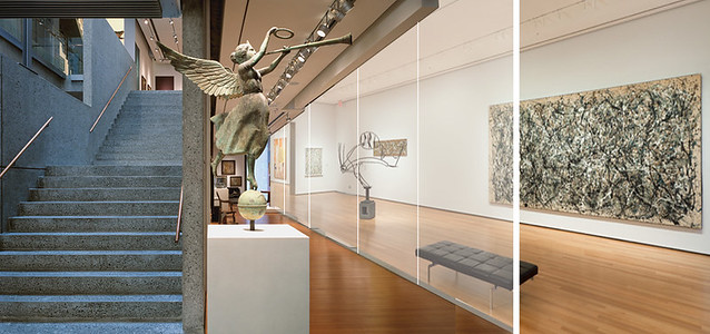
Here's my quick-and-dirty proposal for #FolkMoMA; an idea of how MoMA can reuse the Folk Art Museum rather than tearing it down.
MoMA wants glass? Give 'em a glass wall separating their galleries and the Folk Art galleries. Even if the floors don't align there's a visual connection. People can head down to the first floor to get into the former Folk Art Museum galleries from MoMA, and vice versa.Visit #FolkMoMA's Tumblr site for other ideas.
Original photos: Folk Art Museum by Peter Mauss; MoMA by John Wronn
Today's archidose #666
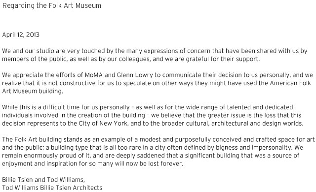
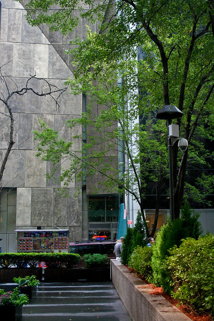
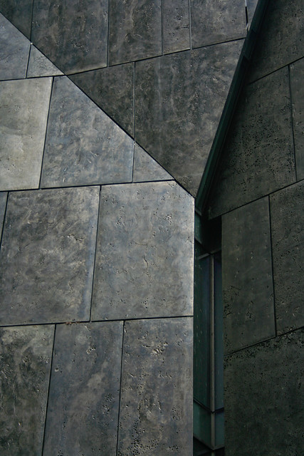
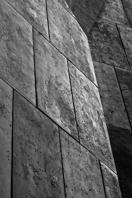
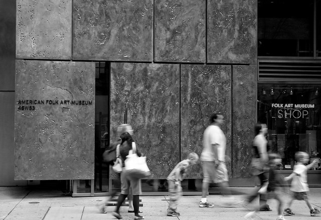
Just so happens that #666 (aka Number of the Beast) of the "today's archidose" series features the soon-to-razed American Folk Art Museum, coming two days after MoMA announced they are going to replace the 12-year-old museum designed by Tod Williams Billie Tsien Architects with an expansion that melds with their building. It's doubtful that the MoMA expansion will have as much exterior character or interior richness as its predecessor. Shame on MoMA for not finding a way to keep this important building.
A screenshot from the TWBTA website:
Some photos by Scott Norsworthy:
To contribute your Flickr images for consideration, just:
A screenshot from the TWBTA website:
Some photos by Scott Norsworthy:
To contribute your Flickr images for consideration, just:
:: Join and add photos to the archidose pool, and/or
:: Tag your photos archidose
Book Review: All the Buildings in New York
All the Buildings in New York: That I've Drawn So Far by James Gulliver Hancock
Universe, 2013
Hardcover, 64 pages
New York City is a great subject for just about any type of book: architecture, art, children's books, and guidebooks, to name a few. Australian illustrator James Gulliver Hancock manages to meld at least these four subjects in the first published collection of the sketches he's been amassing and sharing on his blog. The book documents many of the city's famous architectural icons, making it an architectural guide of sorts, but it also includes many fairly anonymous buildings, which goes along with his unrealistic yet endearing goal to draw all of the buildings in New York. His style also bridges art and a children's picture book; his skewed perspectives, exaggerated details and playful compositions lean to the latter, but his abilities as an artist are clear. Some of the best depictions meld architectural perspectives with two-dimensional paintings, such as the patterned abstraction he uses for the addition to the Guggenheim.
At only 64 pages the book just scratches the surface of the reportedly 900,000 buildings in New York City; one estimate is 500 buildings in the book (some sketches group multiple buildings), making it about one half of one percent of the total. It's an interesting mix of iconic buildings and what many people call background buildings, the ones that even tourists hardly recognize when walking around the city. It's clear that Hancock does not play favorites. A group of three buildings in the Lower East Side is drawn with as much attention to detail and color as the nearby New Museum; if anything the former actually gives a stronger sense of place than the latter, since the New Museum is missing its neighbors. Ultimately the book is a peek into Hancock's mind more than it is an architecture book or a guidebook. His playful and colorful style also make the book suitable for people of any age.
US: CA: UK:
New York City for Design Lovers
Here is a guide to NYC that I recently put together for Houzz. Click the arrows in the bottom-left corner to cycle through, and click the photos to see the whole Ideabook (recommended, since the embedded slideshow is only partial).
Kerb 21 Call for Submissions
Kerb, the journal of landscape architecture at RMIT University, is turning 21. To mark this birthday the editors are seeking submissions around a theme:
"Responsive Practice, Adapted Modes"Click here or the image above to download the hi-res Call for Submissions.
We seek submissions documenting your design projects and processes in the form of research, essays, sketches and diagrams, collage, prose, photography, film, digital animations or film, grassroots projects, folk and contemporary art and everything in between.
We encourage students and practitioners of all creative disciplines to respond to the call for submissions.
Tuesday Evening Recap
Before heading home last night I stopped by a couple events taking place at the New York Public Library and Van Alen Books.
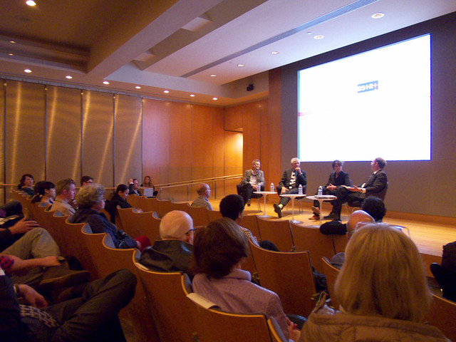
First was a book launch for Lincoln Center Inside Out, Diller Scofidio + Renfro's "architectural account" of the 10-year transformation of Lincoln Center. The three partners spoke with Barry Bergdoll in NYPL's South Court auditorium. The coffee table book is uniquely made, in that the whole thing is a series of gatefolds. Outside are full-bleed photos spanning two pages, and inside are detailed vignettes on some aspect of the process. It's an amazing book, one with a justifiably high cover price.
House lights down during the talk:
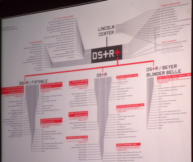
At the end of Liz Diller's 5-minute background on the process, she ended on an organizational chart of the key players in the multi-faceted project; naturally (as admitted) they positioned themselves in the middle of it all. This slide stayed up for the duration of the talk and Q&A, and was referenced on many occasions. It reveals the enormous complexity of the project, something DS+R said would have kept them away from the project if they knew it beforehand (I'm guessing they knew it to some degree, regardless).
House lights up during the Q&A:
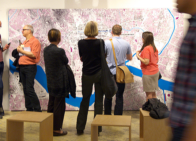
After that I hiked 20 blocks down Fifth Avenue to Van Alen Books and the River City exhibition opening in a space behind the bookstore. The exhibition is the second installment in the River City series (first was on Michael Van Valkenburgh's Brooklyn Bridge Park); it focuses on the Cheonggyecheon River project in Seoul.
The gallery is accessed via an old kitchen:
The gallery is a fairly raw space (revelers at Van Alen Books' launch in April 2011 may remember the space, a partitioning of the area where Jeanne Gang and Anthony Vidler were signing books) with panels placed in front of unfinished drywall and plywood.
The exhibition started at Harvard GSD. Check the River City website for upcoming events related to the exhibition.
NYC Slo-Mo
Here is a two-minute clip of James Nares's Street, now on display at the Metropolitan Museum of Art. The slow-motion pan along a NYC street is hypnotic, aided by Thurston Moore's 12-string instrumental.
(via Fast Company)
(via Fast Company)
Today's archidose #665
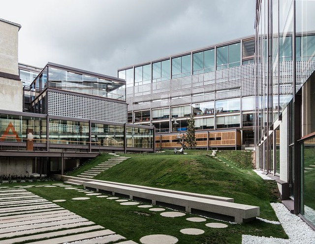
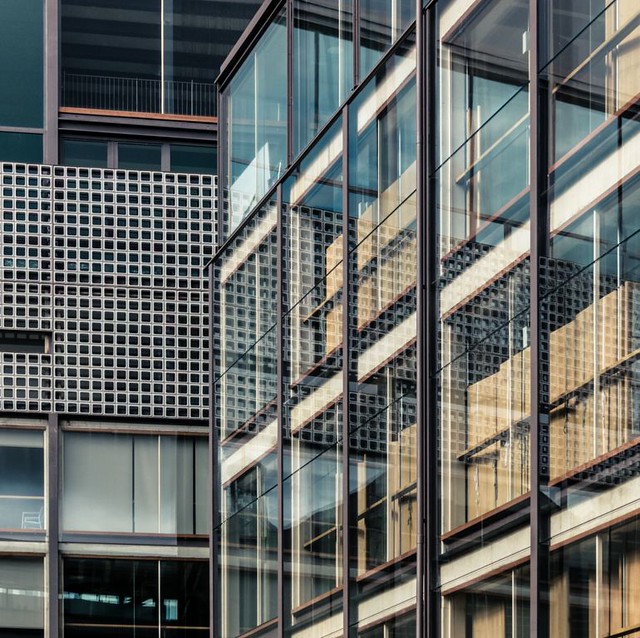
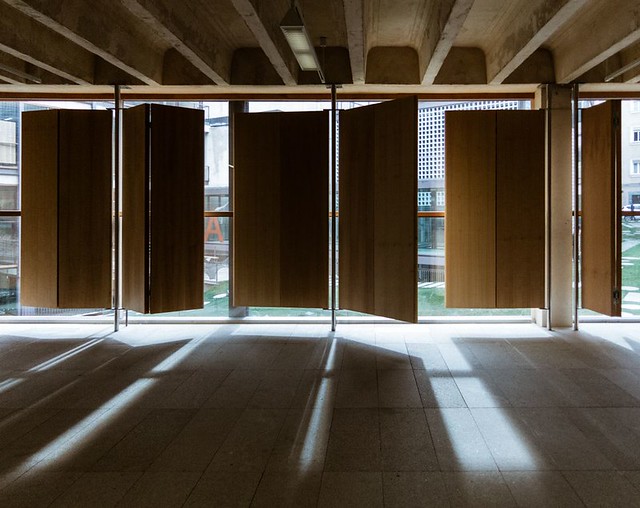
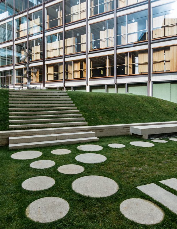
Here are some photos of the New COAM Headquarters (2012) in Madrid, Spain, by Estudio Gonzalo Moure, photographed by Ximo Michavila.
To contribute your Flickr images for consideration, just:
:: Join and add photos to the archidose pool, and/or
:: Tag your photos archidose
Monday, Monday
A Weekly Dose of Architecture Updates:
This week's dose features the Israel National Library in Jerusalem, Isreal, by Gil Even-Tsur Architecture Workshop:
The featured past dose is The Northern Gate in Bat Yam, Israel by Team But, Yam:
This week's book review is Hidden Cities: Travels to the Secret Corners of the World's Great Metropolises; A Memoir of Urban Exploration by Moses Gates (L):
(R): The featured past book review is The Landscape of Contemporary Infrastructure by Kelly Shannon and Marcel Smets.
: : : : : : : : : : : : : : : : : : : : : : :
American-Architects Building of the Week:
(Week of April 1): Reva and David Logan Center for the Arts in Chicago, Illinois, by Tod Williams Billie Tsien Architects:
(Week of April 8): Indiana University Cyberinfrastructure Building in Bloomington, Indiana, by SmithGroupJJR:
Subscribe to:
Posts (Atom)